Release Notes
Notes for every release in the 5.x line are collected on this page. Other majors: 6.x, 4.x.
- v5.6 — Range Selection
- v5.6 — Spreadsheet
- v5.6 — Components
- v5.6 — Editing
- v5.6 — Validators
- v5.6 — Clipboard
- v5.6 — Events
- v5.6 — Internal Events
- v5.6 — Keybindings
- v5.6 — Row Selection
- v5.6 — CSS Styling
- v5.6 — Bug Fixes
- Version 5.5 Release Notes
- Version 5.4 Release Notes
- Version 5.3 Release Notes
- Version 5.2 Release Notes
- Version 5.1 Release Notes
- Version 5.0 Release Notes
Range Selection
This release sees the introduction of the new range selection module. This module lets you select a range of cells instead of just a row.
Range selection allows users to select and highlight a block of cells across rows and columns that you can then take action on.
Try some of the following on the table below:
- Select a range - Click and drag across multiple cells
- Navigate the table - Click on a cell and use the arrow keys to navigate round the table
- Expand a range - After selecting a range hold down the shift key and either drag the mouse or use the arrow keys to change the size of the selected range
- Multiple Ranges - After selecting a range, hold down the crtl key and click and drag to select additional ranges.
- Programatically Add Ranges - Click the "Select Range" button to programmatically add ranges with the addRange function.
Compatibility
This module is currently only available with the Virtual renderes and will not work with the Basic renderers
Navigation
The range module allows you to navigate around the table using the arrow keys.
Cell Navigation
When a cell has focus, using any of the arrow keys will cause the selected cell to move one cell in the direction of the arrow key pressed.
Jump Navigation
Holding the ctrl key when pressing an arrow key will cause the focus to skip to the next cell with a value in the direction you are navigating. This will skip any empty cells (if pressent) between the current cell and the next cell with a value.
Expand Navigation
Holding the shift key when pressing an arrow key will expand the current range in the direction of the arrow key pressed.
Jump Expand Navigation
Holding the ctrl and shift keys when pressing an arrow key will expand the current range to the next cell with a value in the direction of the arrow key pressed. This will skip any empty cells (if pressent) between the current cell and the next cell with a value.
Setup
To enable range selection, set the selectableRange option to true
var table = new Tabulator("#example-table", {
	selectableRange:true,
});
The selectableRange option can take one of a several values:
- false - range selection is disabled
- true - range selection is enabled, and you can add as many ranges as you want
- integer - any integer value, this sets the maximum number of ranges that can be selected (when the maximum number of ranges is exceded, the first selected range will be deselected to allow the next range to be selected).
Layout Change
changing the layout or data of the table will result in all ranges being cleared
Selectable Columns
By default you can only select ranges by selecting cells on the table. If you would like to allow the user to select all cells in a column by clicking on the column header, then you can set the selectableRangeColumns option to true
var table = new Tabulator("#example-table", {
  selectableRange:true,
  selectableRangeColumns:true,
});
Header Sorting
You cannot use column header sorting with this option, unless you set the headerSortClickElement option to icon
Selectable Rows
By default you can only select ranges by selecting cells on the table. If you would like to allow the user to select all cells in row by clicking on the first column in a row, then you can set the selectableRangeColumns option to true
var table = new Tabulator("#example-table", {
  selectableRange:true,
  selectableRangeRows:true,
});
A good idea for a row header is to setup a frozen column with the rownum formatter. An example setup for a row header would be:
var table = new Tabulator("#example-table", {
    columns:[
        {resizable: false, frozen: true, width:40, hozAlign:"center", formatter: "rownum"}, //setup row header for spreadsheet
        ... other columns ...
    ],
});
Header Sorting
You cannot use column header sorting with this option, unless you set the headerSortClickElement option to icon
Selection Management
As well as clicking on a row, you can trigger the selection of a range programmatically.
Range Bounds
When creating or editing an existing range programatically, you woill need to define the bounds for the selected area.
The bounds os of a selection are defined using the top-left and bottom-right cells of a selected area, the system can then calculate the cells contained in this boundry by drawing a rectangle between the two points
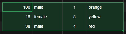
In the example above the top left cell with a value of "100" would be the start bound, and the bottom right cell with a value of "red" would be the end bound.
Add Range
To programmatically select a range of cells you can use the addRange function.
To select a range of cells you should call the addRange function, passing in the Cell Components for the top-left and bottom-right bounds of the selection:
    var topLeft = table.getRows()[2].getCells()[1];
    var bottomRight = table.getRows()[5].getCells()[6];

    var range = table.addRange(topLeft, bottomRight);
This will then return the Range Component for the new range.
Get Selected Range Components
To get the Range Component's for all the current ranges you can use the getRanges function.
var ranges = table.getRanges(); //get array of currently selected range components.
This will return an array of Range Components for all the current ranges.
Get Selected Data
To get the data objects for all the selected cell ranges you can use the getRangesData function.
var rangeData = table.getRangesData(); //get array of currently selected data.
This will return an array of range data arrays, with data array per range. Each range data array will contain a series of row data objects with only the props for cells in that range:
[
    [ //range 1
        {name:"Bob Monkhouse", age:83}, //data for selected cells in first row in range
        {name:"Mary May", age:22}, //data for selected cells in second row in range
    ],
    [ //range 2
        {color:"green", country:"England", driver:true}, //data for selected cells in first row in range
        {color:"red", country:"USA", driver:false}, //data for selected cells in second row in range
        {color:"blue", country:"France", driver:true}, //data for selected cells in third row in range
    ],
]
Clear Data
If you want the user to be able to clear the values for all cells in the active range by pressing the backspace or delete keys, then you can enable this behaviour using the selectableRangeClearCells option:
var table = new Tabulator("#example-table", {
      selectableRangeClearCells:true,
});
By default the value of each cell in the range is set to undefined when this option is enabled and the user presses the backspace or delete keys. You can change the value the cells are set to using the selectableRangeClearCellsValue option:
var table = new Tabulator("#example-table", {
      selectableRangeClearCellsValue:"", // set cleared cells to to an empty string
});
Spreadsheet
While not a new feature in its own right, by using the new range selection functionality in addition to the edit and clipboard modules, you can configure Tabulator to function as a spreadsheet.
Try some of the following on the table below:
- Editing a cell - Double click on a cell or focus on a cell and press the enter key
- Copy a cell - Click on a cell with a value in, press ctrl+c click on another cell and press ctrl+v
- Navigate the table - Click on a cell and use the arrow keys to navigate round the table
- Select a range - Click and drag across multiple cells
- Expand a range - After selecting a range hold down the shift key and either drag the mouse or use the arrow keys to change the size of the selected range
- Copy a range - After selecting a range, press ctrl+c then click on a different cell and press ctrl+v to paste the range starting from that cell
- Paste to fill - Select a cell or range with values in, press ctrl+c then select a different size range (more than one cell) and press ctrl+v. Notice how it pastes the data to fill the range, either duplicating rows and columns as needed, or hiding data that wont fit.
- Duplicating a column - Click on a column header to select a whole column, press ctrl+c, click into another column header and press ctrl+v
- Duplicating a row - Click on a row header to select a whole row, press ctrl+c, click into another row header and press ctrl+v
Components
Row Range Lookup
With the addition of the selectable range module, a new Row Range Lookup option of range has been added, to allow you to use the selected ranges in other table functions
var table = new Tabulator("#example-table", {
    clipboardCopyRowRange:"range", //copy selected ranges to the clipboard
});
This new range lookup option can be used in any table setup option that accepts row range lookups as a value.
Range Component
The addition of the selectable range module also sees the creation of a new type of component object, the range component, this can be used to manipulate the cells selected in a given range. Full details for the range component options can be found in the Range Component Documentation
These component objects are returned from table functions like getRanges or from range based events.
var ranges = table.getRanges(); //get array of currently selected range components.
table.on("rangeAdded", function(range){
    //range - range component for the selected range
});
Update Range Bounds
You can update the bounds for an existing range using the setBounds function, passing in the Cell Components for the top-left and bottom-right bounds of the selection:
    var topLeft = table.getRows()[2].getCells()[1];
    var bottomRight = table.getRows()[5].getCells()[6];

    range.setBounds(topLeft, bottomRight);
Update Range Start
You can change the top left start edge of an existing range using the setStartBound function, passing in the Cell Component for the top left bound of the selection:
    var topLeft = table.getRows()[2].getCells()[1];

    range.setStartBound(topLeft);
Update Range End
You can change the bottom right ending edge of an existing range using the setEndBound function, passing in the Cell Component for the bottom right bound of the selection:
    var bottomRight = table.getRows()[5].getCells()[6];

    range.setEndBound(bottomRight);
Remove Range
You can remove a range by calling the remove function on the range:
range.remove();
Get Element
You can retrieve the bounding rectagle element for a range by calling the getElement function on the range:
var element = range.getElement();
Get Data
You can retrieve the cell data for a range by calling the getData function on the range:
var data = range.getData();
This will return a range data array, which is structured as a series of row data objects with only the props for cells in that range:
[
    {color:"green", country:"England", driver:true}, //data for selected cells in first row in range
    {color:"red", country:"USA", driver:false}, //data for selected cells in second row in range
    {color:"blue", country:"France", driver:true}, //data for selected cells in third row in range
]
Clear Values
You can clear the value of every cell in a range by calling the clearValues function on the range:
var data = range.clearValues();
This will set the value of every cell in the range to the value of the selectableRangeClearCellsValue table option, which is set to undefined by default.
Get All Cells
You can retrieve all the Cell Components in a range by calling the getCells function on the range:
var cells = range.getCells();
This will return a array of Cell Components
Get With Structure
You can retrieve a structured map of all the Cell Components in a range by calling the getStructuredCells function on the range:
var cells = range.getStructuredCells();
This will return a array of row arrays, with each row array containing the Cell Components in order for that row:
[
    [Component, Component, Component], //first row
    [Component, Component, Component], //second row
    [Component, Component, Component], //third row
]
Get Rows
You can retrieve all the Row Components in a range by calling the getRows function on the range:
var rows = range.getRows();
This will return a array of Row Components
Get Columns
You can retrieve all the Column Components in a range by calling the getColumns function on the range:
var columns = range.getColumns();
This will return a array of Column Components
Get Bounds
You can retrieve the bounds of a range by calling the getBounds function on the range:
var bounds = range.getBounds();
This will return an object containing two Cell Components, for the two bounds of the range
{
    start:Component, //the cell component at the top left of the range
    end:Component, //the cell component at the bottom right of the range
}
Get Top Edge
You can find the position number for the top row of the range by calling the getTopEdge function on the range:
var topPosition = range.getTopEdge();
Get Bottom Edge
You can find the position number for the bottom row of the range by calling the getBottomEdge function on the range:
var bottomPosition = range.getBottomEdge();
Get Left Edge
You can find the position number for the left column of the range by calling the getLeftEdge function on the range:
var leftPosition = range.getLeftEdge();
Get Right Edge
You can find the position number for the right column of the range by calling the getRightEdge function on the range:
var rightPosition = range.getRightEdge();
Row Component
Get Ranges
You can retreive all ranges that overlap a row by calling the getRanges function:
var ranges = row.getRanges();
This will return an array of Range Components for any ranges that overlap the row. If no ranges overlap the row, an empty array will be returned.
Column Component
Get Ranges
You can retreive all ranges that overlap a column by calling the getRanges function:
var ranges = column.getRanges();
This will return an array of Range Components for any ranges that overlap the column. If no ranges overlap the column, an empty array will be returned.
Cell Component
You can retreive all ranges that overlap a cell by calling the getRanges function:
var ranges = cell.getRanges();
This will return an array of Range Components for any ranges that overlap the cell. If no ranges overlap the cell, an empty array will be returned.
Editing
Edit Trigger Event
The new editTriggerEvent option lets you choose which type of interaction event will trigger an edit on a cell.
var table = new Tabulator("#example-table", {
    editTriggerEvent:"dblclick", //trigger edit on double click
});
This option can take one of three values:
- focus - trigger edit when the cell has focus (default)
- click - trigger edit on single click on cell
- dblclick - trigger edit on double click on cell
This option does not affect navigation behavior, cells edits will still be triggered when they are navigated to through arrow keys or tabs.
Validators
Alphanumeric Validator
The new alphanumeric validator allows values that are explicitly numbers and letters with no symbols or spaces
{title:"Example", field:"example", validator:"alphanumeric"}
Clipboard
The clipboard module has had several updates to add intergration with the new range selection module
Copy Row Range
The clipboardCopyRowRange option, now accepts the range value to allow copying of cell ranges from the table
var table = new Tabulator("#example-table", {
    clipboardCopyRowRange:"range", //change default selector to selected
});
Range Paste Parser
The clipboardPasteParser option, now accepts the range value to allow pasting of cell ranges to the table
var table = new Tabulator("#example-table", {
    clipboardPasteParser:"range", //use the range parser
});
Range Paste Action
The clipboardPasteAction option, now accepts the range value to allow pasting of cell ranges to the table
var table = new Tabulator("#example-table", {
    clipboardPasteAction:"range", //use the range paste action
});
Events
Range
The addition of the selectable range module also includes a number of new events.
Range Added
The rangeAdded event is triggered when a range is initialy selected, either by the user or programmatically.
table.on("rangeAdded", function(range){
    //range - range component for the selected range
});
Range Changed
The rangeChanged event is triggered when a the bounds of an existing range are changed.
table.on("rangeChanged", function(range){
    //range - range component for the selected range
});
Range Removed
The rangeRemoved event is triggered when a range is removed from the table.
table.on("rangeRemoved", function(range){
    //range - range component for the selected range
});
Internal Events
Edit
New internal events have been added to allow overriding of the default blur behaviour of edited cells.
| Key | Type | Arguments | Response | Notes |
|---|---|---|---|---|
| edit-blur | confirm | cell | returning true will prevent the default blur behaviour | Dispatched when an edit is about to blur the cell focus, to give the opertunity to preven or override this behaviour |
Menu
New internal events have been added to help track when a menu is opened or closed
| Key | Type | Arguments | Response | Notes |
|---|---|---|---|---|
| menu-opened | dispatch | menu, popup | A new menu has been opened | |
| menu-closed | dispatch | menu, popup | A menu has been closed |
Keybinding
A new internal event has been added to help track when a range navigation keybining is triggered
| Key | Type | Arguments | Response | Notes |
|---|---|---|---|---|
| keybinding-nav-range | dispatch | trigger event, direction, jump, expand | A range navigation action has been triggered by a keybinding |
Column
New internal events have been added to track when a column has finished being deleted.
| Key | Type | Arguments | Response | Notes |
|---|---|---|---|---|
| column-deleted | dispatch | column | Column has been deleted |
Alert
New internal events have been added to track when alerts open and close
| Key | Type | Arguments | Response | Notes |
|---|---|---|---|---|
| alert-show | dispatch | type | An alert has been opened | |
| alert-hide | dispatch | type | An alert has been hidden |
Clipboard
New internal events have been added to allow handling of clipboard paste events.
| Key | Type | Arguments | Response | Notes |
|---|---|---|---|---|
| clipboard-paste | confirm | paste event | returning true will prevent the paste event from being handled by the cliboard module | A user has pasted content into the table |
keybindings
Range Keybindings
A number of new default keybindings have been added to aid in range navigation of the table:
| Action | Default Key Combination (keycode) | Function |
|---|---|---|
| rangeJumpUp | ctrl + up ("ctrl + 38") OR meta(cmd) + up ("meta + 38") | Navigate range cursor up to next cell with value |
| rangeJumpDown | ctrl + down ("ctrl + 40") OR meta(cmd) + down ("meta + 40") | Navigate range cursor down to next cell with value |
| rangeJumpLeft | ctrl + left ("ctrl + 37") OR meta(cmd) + left ("meta + 37") | Navigate range cursor left to next cell with value |
| rangeJumpRight | ctrl + left ("ctrl + 39") OR meta(cmd) + left ("meta + 39") | Navigate range cursor left to next cell with value |
| rangeExpandUp | shift + up ("ctrl + 38") | Expand active range up one row |
| rangeExpandDown | shift + down ("ctrl + 40") | Expand active range down one row |
| rangeExpandLeft | shift + left ("ctrl + 37") | Expand active range left one column |
| rangeExpandRight | shift + right ("ctrl + 39") | Expand active range right one column |
| rangeExpandJumpUp | ctrl + shift + up ("ctrl + shift + 38") OR meta(cmd) + shift + up ("meta + shift + 38") | Expand active range up to next cell with value |
| rangeExpandJumpDown | ctrl + shift + down ("ctrl + shift + 40") OR meta(cmd) + shift + down ("meta + shift + 40") | Expand active range down to next cell with value |
| rangeExpandJumpLeft | ctrl + shift + left ("ctrl + shift + 37") OR meta(cmd) + shift + left ("meta + shift + 37") | Expand active range left to next cell with value |
| rangeExpandJumpRight | ctrl + shift + right ("ctrl + shift + 39") OR meta(cmd) + shift + right ("meta + shift + 39") | Expand active range right to next cell with value |
Row Selection
With the addition of the range selection module, all row selection options have now been renamed for clarity.
Enable Row Selection
Anywhere you used the selectable option:
var table = new Tabulator("#example-table", {
    selectable:true, //make rows selectable
});
You should now use the selectableRows option:
var table = new Tabulator("#example-table", {
    selectableRows:true, //make rows selectable
});
Rolling Row Selection
Anywhere you used the selectableRollingSelection option:
var table = new Tabulator("#example-table", {
    selectableRollingSelection:false, //disable rolling selection
});
You should now use the selectableRowsRollingSelection option:
var table = new Tabulator("#example-table", {
    selectableRowsRollingSelection:false, //disable rolling selection
});
Range Mode
Anywhere you used the selectableRangeMode option:
var table = new Tabulator("#example-table", {
    selectableRangeMode:"click", //select row range on click
});
You should now use the selectableRowsRangeMode option:
var table = new Tabulator("#example-table", {
    selectableRowsRangeMode:"click", //select row range on click
});
Persistent Selection
Anywhere you used the selectablePersistence option:
var table = new Tabulator("#example-table", {
    selectablePersistence:false, //disable selection peristence
});
You should now use the selectableRowsPersistence option:
var table = new Tabulator("#example-table", {
    selectableRowsPersistence:false, //disable selection peristence
});
Persistent Selection
Anywhere you used the selectableCheck option:
var table = new Tabulator("#example-table", {
    selectableCheck:function(row){
        //row - row component
        return row.getData().age > 18; //allow selection of rows where the age is greater than 18
    },
});
You should now use the selectableRowsCheck option:
var table = new Tabulator("#example-table", {
    selectableRowsCheck:function(row){
        //row - row component
        return row.getData().age > 18; //allow selection of rows where the age is greater than 18
    }
});
CSS Styling
CSS Classes
A number of new CSS classes have been added to the table with the new range selection module
| Class | Element Description |
|---|---|
| tabulator-ranges | Applied to the table container when range selection is enabled |
| tabulator-range-highlight | Applied to a column header or row when a cell in that column is included in a range |
| tabulator-range-selected | Applied to a column header or row header when that entier row or column is included in a range |
| tabulator-range-row-header | Applied to the row header cell for a row |
| tabulator-range-overlay | The containing element for all range area overlays |
| tabulator-range | The overlayed area graphic for a range |
| tabulator-range-active | Applied to the active range overlay area |
| tabulator-range-active | Applied to the active range overlay area |
SASS Variables
A number of new SASS Variables have been added to the table with the new range selection module
| Variable | Default Value | Description |
|---|---|---|
| rangeBorderColor | #2975DD | Range selection border colour |
| rangeHandleColor | #2975DD | Range selection handle colour |
| rangeHeaderSelectedBackground | #3876CA | Range column header selected backgroud Colour |
| rangeHeaderSelectedTextColor | #FFFFCA | Range column header selected text Colour |
| rangeHeaderHighlightBackground | #D6D6CA | Range column header highlighted backgroud Colour |
| rangeHeaderTextHighlightBackground | #0000CA | Range column header highlighted text Colour |
Bug Fixes
v5.6.0 Release
The following minor updates and bugfixes have been made:
- Updating a column definition to freeze a column now works successfully
- Toggling the visibility of a frozen column will no longer cause a visual glitch
- Column resizing now works for frozen columns
- Table resize functionality now works correctly on mobile devices when the edit module is not installed
- Column header vertical alignment is recalculated after initial data load
- Top column calcks and frozen rows will now correctly render when scrolled horizontally
- Alerts poping up while moving columns now cancle the column move
- History actions now correctly clear and restore the empty table placeholder
- The placeholder is now correctly positioned on tables using the basic renderer
- The selectRow and deselectRow functions now correctly handle rows with an index of 0
- Fixed missing getTable function on psuedo cell component used in export module
v5.6.1 Release
The following minor updates and bugfixes have been made:
- Fixed issues with rendering in range selection module when no row header defined
- Fixed regression in frozen columns module when frozen columns are initially hidden
- Fix issue in time and datetime editors where 24 hour times were not being handled correctly
- You can now use the editableTitle and movableColumns options together without dragging the mouse in the title input causing the column to be moved
- Using events after calling the setHeight function will no longer result console warnings
- Fixed regression that caused text areas to not resize on table resize, introduced during performance improvements in v5.5
- Editors can now only trigger success or cancel calls once (if validation passes) to prevent duplicate events
Version 5.5 Release Notes
Performance Improvements
Vertical Virtual Renderer
The vertical virtual renderer has been updated to take advantage of document fragments to build out table rows in blocks rather than one at a time.
This has had the effect of making the table render and redraw when using dynamic height rows, and 2 times faster when using fixed height rows.
Editing
Editor Updates
Date Editor
The new verticalNavigation option for the date editor allows you to determine how the up and down arrow keys affect the editor:
{title:"Example", field:"example", editor:"date", editorParams:{
    verticalNavigation:"table", //navigate cursor around table without changing the value
}}
The verticalNavigation param can take one of two values:
- editor - the arrow keys increment/decrement the selected value but will not navigate round the table (default)
- table - the arrow keys will navigate to the prev/next row and will not move the cursor in the editor
DateTime Editor
The new verticalNavigation option for the datetime editor allows you to determine how the up and down arrow keys affect the editor:
{title:"Example", field:"example", editor:"date", editorParams:{
    verticalNavigation:"table", //navigate cursor around table without changing the value
}}
The verticalNavigation param can take one of two values:
- editor - the arrow keys increment/decrement the selected value but will not navigate round the table (default)
- table - the arrow keys will navigate to the prev/next row and will not move the cursor in the editor
Time Editor
The new verticalNavigation option for the time editor allows you to determine how the up and down arrow keys affect the editor:
{title:"Example", field:"example", editor:"date", editorParams:{
    verticalNavigation:"table", //navigate cursor around table without changing the value
}}
The verticalNavigation param can take one of two values:
- editor - the arrow keys increment/decrement the selected value but will not navigate round the table (default)
- table - the arrow keys will navigate to the prev/next row and will not move the cursor in the editor
Formatting
Formatter Updates
Money Formatter
The money formatter has been updated to add the negativeSign formatter param. This allows you to specify the symbol that should be shown in front of negative numbers (default "-")
{title:"Example", field:"example", formatter:"money", formatterParams:{
    negativeSign:"!", //show the ! symbol in front of negative numbers instead of the - symbol
}}
Passing a value of true to this option will cause negative numbers to be wrapped in parentheses (123.45), which is the standard style for negative numbers in accounting.
{title:"Example", field:"example", formatter:"money", formatterParams:{
    negativeSign:true, //show negative numbers wrapped in parentheses
}}
Placeholders
Empty Table Placeholder Callback
The placeholder option can now take a callback function that will be run when the placeholder has shown, this lets you customize your placeholder based on external factors.
var table = new Tabulator("#example-table", {
    placeholder:function(){
        return this.getHeaderFilters().length ? "No Matching Data" : "No Data"; //set placeholder based on if there are currently any header filters
    }
});
Header Filter Empty Table Placeholder
You can use the placeholderHeaderFilter option to display a different message to your users when the table has no data available as a result of header filters being active.
var table = new Tabulator("#example-table", {
    placeholderHeaderFilter:"No Matching Data", //display message to user on empty table due to header filters
});
Persistence
Header Filter Persistence
You can ensure the data header filters are stored for the next page load by setting the headerFilter property of the persistence option to true
This will persist all active column header filters on the table
var table = new Tabulator("#example-table", {
    persistence:{
        headerFilter: true, //persist header filters
    }
});
Built In Filters
Only built-in filters can be stored (including module), custom filter functions cannot be persistently stored.
Column Calculations
Calculation Functions
Unique
The new unique function counts the number of unique non-empty values in a column (cells that do not have a value of null, undefined or "").
{title:"Example", field:"example", topCalc:"unique"}
Downloads
XLSX Downloader
SheetJS File Write Options
You can now configure the type of file output from the SheetJS library using the native SheetJS file writing options with the optional writeOptions option.
table.download("xlsx", "data.wk3", {
    writeOptions:{
        bookType:"wk3", //save file in lotus notes format
    }
});
Events
Updated Events
Row Selection Changed
Two new arguments have been added to the rowSelectionChanged event to make it easier to track the changes in selection as a result of the event.
In addition to the first and second arguments that show the currently selected rows, the third argument now contains an array of Row Components for the any rows selected in the last action, and the fourth argument now contains an array of Row Components for any rows deselected in the last action.
table.on("rowSelectionChanged", function(data, rows, selected, deselected){
    //rows - array of row components for the currently selected rows in order of selection
    //data - array of data objects for the currently selected rows in order of selection
    //selected - array of row components that were selected in the last action
    //deselected - array of row components that were deselected in the last action
});
Component Objects
Cell Component
Get Type
The new getType function on the CellComponent can be used to determine if the cell is being used as a cell or a header element. This can be useful for editors or formatters if you want them to behave differently when used ina header vs a cell.
var type = cell.getType();
This function will return a string:
- cell - This cell is being used as a cell
- header - This cell is being used as a header
Trigger Accessor on Get Data
The getData function has been updated to accept an optional argument, that is the transform type for column accessors. You can use this to trigger accessors on the row data when calling the function
var data = cell.getData("data");
Row Component
Scroll To Row
The scrollTo function has been updated with two optional arguments to change the behaviour of the scroll
The first optional argument is used to set the position of the row, it should be a string with a value of either top, center, bottom or nearest, if omitted it will be set to the value of the scrollToRowPosition option which has a default value of top.
The second argument is optional, and is a boolean used to set if the table should scroll if the row is already visible, true to scroll, false to not, if omitted it will be set to the value of the scrollToRowIfVisible option, which defaults to true
row.scrollTo("bottom", true); //scroll row to bottom if it is currently visible
Column Component
Scroll To Column
The scrollTo function has been updated with two optional arguments to change the behaviour of the scroll
You can pass optional arguments to the function to change the behaviour of the scroll. The first argument is used to set the position of the column, it should be a string with a value of either left, middle or right, if omitted it will be set to the value of the scrollToColumnPosition option which has a default value of left.
The second argument is optional, and is a boolean used to set if the table should scroll if the column is already visible, true to scroll, false to not, if omitted it will be set to the value of the scrollToColumnIfVisible option, which defaults to true
column.scrollTo("right", true); //scroll column to right if it is currently visible
Group Component
Scroll To Group Header
The scrollTo function will scroll the table to the group header if it passes the current filters.
group.scrollTo();
You can pass optional arguments to the function to change the behaviour of the scroll. The first optional argument is used to set the position of the group header, it should be a string with a value of either top, center, bottom or nearest, if omitted it will be set to the value of the scrollToRowPosition option which has a default value of top.
The second argument is optional, and is a boolean used to set if the table should scroll if the group header is already visible, true to scroll, false to not, if omitted it will be set to the value of the scrollToRowIfVisible option, which defaults to true
group.scrollTo("top", true); //scroll group to top if it is currently visible
The scrollTo method returns a promise, this can be used to run any other commands that have to be run after the group has been scrolled to. By running them in the promise you ensure they are only run after the group has been scrolled to.
group.scrollTo()
.then(function(){
    //run code after group has been scrolled to
})
.catch(function(error){
    //handle error scrolling to group
});
Internal Events
New internal events have been added in this release.
Placeholder
The placeholder event is a chain type event, that is triggered when the placeholder is about to be displayed.
It passes the current placeholder content as its first argument. and should return the content for the placeholder if it wants to replace it,either a string or HTML.
this.subscribe("placeholder", function(placeholder) => {
    //placeholder - current placeholder value

    return "New Placeholder" //set new placeholder;
});
Bug Fixes
v5.5.0 Release
The following minor updates and bugfixes have been made:
- Tap events are no longer erroneously triggered when scrolling the table
- Hover styling for all elements has been suppressed on mobile devices
- Using a horizontal scroll wheel in the table header will now cause the table to scroll horizontally
- The list eidtor now handles tab behaviour in a similar fashion to other editors, selecting the currently focused element in the list when the tab key is pressed
- Fixed a header alignment issue in the modern theme CSS
- Fixed console error when destroying tables with selected rows
- Fix typo in datatree module getRows function
- The table will correctly scroll to focus on cells being edited when they are tabbed to.
- Calling the updateDefinition function on a Column Component will no longer cause a console error when changing the frozen column option
v5.5.1 Release
The following minor updates and bugfixes have been made:
- The data argument of the groupHeader callback is now passed an array of all data included in that group, including child rows when using nested groups
- Fixed console error when redrawing the table with the dataTree option enabled
- If a table is destroyed, any outstanding ajax request responses are ignored
- Fixed function mapping issue on jQuery wrapper
- The placeholder element is now visible on empty tables with no fixed height
- The history module undo and redo actions for row movement, now move the row to the correct position
- The history module undo and redo actions for row movement, now correctly redraw the table after the action is performed
- The groupClick and groupDblClick events are now correctly triggered when the groupToggleElement option is set to header and the group header element is clicked
- Fixed visual corruption when using frozen columns and the materialize theme
- Fixed visual corruption when using frozen columns and the semantic-ui theme
- Fixed regression in onRendered function passed into formatters, it is now correctly called after a cell has been added to the DOM
- Fixed regression in cell height calculation for basic vertical renderer
- Row indentation now works correctly when using the dataTree option with the dataTreeBranchElement option set to false
v5.5.2 Release
The following minor updates and bugfixes have been made:
- Fixed incorrect keybinding for copy function on mac
- Fixed issue with widthShrink and widthGrow not working when table data is imported from HTML
- Fixed issue with HTML Import functionality not correctly formatting column field names if the name had multiple spaces in it
- Resize handles now longer float in front of frozen columns
v5.5.3 Release
The following minor updates and bugfixes have been made:
- The link formatter now correctly handles nested data lookup from the urlField formatter param
- The tabEndNewRow option will now not create a new row if there is a validation failure on the last table cell when it is bing edited
- Fixed issue with row management pipeline not being fully initialized with remote data loading
- Ensure nestedFieldSeparator option is correctly applied when handling row updates
- The setColumnLayout function now correctly applies all settings passed into the function, not just those currently set in a columns definition
- Ajax params passed to the setData function now correctly override those set in the ajaxParams setup option
- Removed incorrect mouse pointer from disabled pagination buttons
- The setPageToRow function will no longer throw an error when called
v5.5.4 Release
The following minor updates and bugfixes have been made:
- fix regression in last release with node-sass becoming a prod dependency
Version 5.4 Release Notes
Performance Improvements
This update sees a number of significant performance improvments across a number of different table builds and modules.
UMD Distributions
The UMD distributions, tabulator.js and tabulator.min.js used to use the Bable transpiler as part of their build chain to convert the modern ESM module syntax of the source to something backwards compatible with old ES5 browsers.
This was mainly done to allow backawards compatibility with very old browsers like IE11. But this came at a cost, the transpiled code ran about 5 times slower than the ESM module. Which wase barely noticable on small tables, but really added up with large numbers of rows / columns.
With old browsers like IE11 now having reached end of life, this transpilation is no longer needed, and babel has been removed from the build chain.
This has resulted several improvments to the UMD distributions:
- Faster library loading time
- 8x improvment in data loading and render performance
- Smaller file sizes
Backwards Compatibility
As a result of this change, Tabulator will no longer run in environments that require old ES5 support. With all modern browsers being evergreen, and Node JS having long supported the language structures required by Tabulator this shouldn't be a problem.
If you do find that this causes problems for your project, please create an issue on the GitHub repo and we would be happy to add a specific ES5 compatible version of the dist to allow for your usage case.
Module Initialization
The initialization process for each module has been reviewed to ensure it does not trigger unessisary redraws of the table during initialization.
Frozen Columns
The frozen columns module has been completely rebuilt in this release, and now works using position:sticky on frozen cells instead of absolutely positioning them.
This has resulted in a significant performance improvement in horizonal scrolling when frozen columns are enabled.
Column Calculations
Recalculation of column calculations is now blocked when the blockRedraw function is called. When the restoreRedraw function is called, if any recalculations were requested while the table was blocked, then all calculation values are recalculated.
Build Tools
The command line build tools, used for building custom versions of Tabulator have been updated in this release to improve their usability.
Invaild Warning Suppression
To make the build tools simpler and clearer to use, several unnecessary warning that were displayed when Rollup bundled the packages have now been removed. These were shown when using any of the build or dev commands .
Pre-Build Linting
The ESLint tool will now automatically be run before the build tasks when using the build command. Should the linting fail it will present a list of the issues and prevent the build tools from running until they are resolved.
Columns
Header Text Wrap
By default tabulator will truncate overflowing column header title text with an ellipsis if the column is to narrow to contain the title.
If you would prefer the text to wrap, you can now use the new headerWordWrap option.
{title:"This column has a really long title", field:"example", headerWordWrap:true}, //wrap text in column header if it is too narrow
Download
Excel File Compression
File compression has now been enabled by default on the xlsx downloader to significantly reduce the size of the generated file.
Automatic compression can be disabled by setting the compress option to false in the options object:
table.download("xlsx", "data.xlsx", {compress:false}); //prevent compression of output file
Sorting
Header Sort Click Element
By default, header sorting is managed by clicking anywhere on the column header element. You can now restrict this to just the sort icon by setting the headerSortClickElement option to icon:
var table = new Tabulator("#example-table", {
    headerSortClickElement:"icon",
});
This option can take one of two options:
- header - click anywhere on a column header to sort the column (default)
- icon - sort only when clicking on the sort arrow in the column header
Popups
Double Click Popups
Popups are now available on double click mouse events. These work in exactly the same way as the click popups, just with different trigger events
Column Header Double Click Popup
You can add a double left click popup to any column by passing the popup contents to the headerDblClickPopup option in that columns definition.
var table = new Tabulator("#example-table", {
    columns:[
        {title:"Name", field:"name", headerDblClickPopup:"Im a Popup"}, //add double click popup to this column header
    ]
});
Cell Double Click Popup
You can add a double click popup to any cell by passing the popup contents to the dblClickPopup option in that columns definition.
var table = new Tabulator("#example-table", {
    columns:[
        {title:"Name", field:"name", dblClickPopup:"Im a Popup"} //add cell click popup
    ]
});
Row Double Click Popup
You can add a double click popup to any row by passing the popup contents to the rowDblClickPopup option in the table constructor object.
var table = new Tabulator("#example-table", {
    rowDblClickPopup:"Im a Popup"
});
Group Header Double Click Popup
You can add a double click popup to any group header by passing the popup contents to the groupDblClickPopup option in the table constructor object.
var table = new Tabulator("#example-table", {
    groupDblClickPopup:"Im a Popup"
});
Programmatic Popups
As well as triggering a popups as a result of user interaction with the table. you can also trigger a popup by calling the popup function on any columns, row, group or cell Components.
This will cause a popup to display next to the component the function is being called on
row.popup("Hey There", "right");
The first argument of the popup function is the contents of the popup, this can take any of the standard popup contents options.
The second optional argument is the position of the popup relative to the components element. This can take one of 5 values:
- center - the top left of the popup is positioned in the center of the element (default)
- right - the top left of the popup is positioned to the top right of the element
- bottom - the top left of the popup is positioned to the bottom left of the element
- top - the top left of the popup is positioned to the top left of the element
- left - the top left of the popup is positioned to the top left of the element
Menus
Double Click Menus
Menus are now available on double click mouse events. These work in exactly the same way as the click menus, just with different trigger events
Column Header Double Click Menu
You can add a double click menu to any column header by passing the menu array to the headerDblClickMenu option in that columns definition.
var table = new Tabulator("#example-table", {
    columns:[
        {title:"Name", field:"name", headerDblClickMenu:headerContextMenu},
    ]
});
Cell Double Click Menu
You can trigger a cell menu on a double left click by using the dblClickMenu option in the column definition.
//add menu in column definition
var table = new Tabulator("#example-table", {
    columns:[
        {title:"Name", field:"name", dblClickMenu:cellContextMenu},
    ]
});
Row Double Click Menu
You can trigger a row menu on a double left click by using the rowDblClickMenu option in the column definition.
var table = new Tabulator("#example-table", {
    rowDblClickMenu:[
        {
            label:"Delete Row",
            action:function(e, row){
                row.delete();
            }
        },
    ]
});
Group Double Click Menu
You can trigger a group header menu on a double left click by using the groupDblClickMenu table setup option.
var table = new Tabulator("#example-table", {
    groupDblClickMenu:[
        {
            label:"Hide Group",
            action:function(e, group){
                //e - context click event
                //group - group component for group

                group.hide();
            }
        },
    ]
});
Frozen Columns
Module Rebuild
The frozen columns module has been completely rebuilt in this release, and now works using position:sticky on frozen cells instead of absolutely positioning them.
This has resulted in a significant performance improvement in horizonal scrolling when frozen columns are enabled.
A side effect of this is columns now become frozen into position as the scroll to the edge of the screen. This means on tables that have rows narrower than the width of the table, the right frozen columns are now sat next to the table data rather than isolated over to one side.
Horizontal Virtual DOM Compatibility
As a result of this module rebuild, frozen columns are now available when you are using the virtual horizontal renderer for tables with a large number of columns.
RTL Text Direction Compatibility
As a result of this module rebuild, frozen columns are now available when you the table has a textDirection set to rtl
Formatting
Title Formatters
The mock cell component passed into the titleFormatter callback has been updated to include the standard getColumn and getTable functions.
//column definition in the columns array
{title:"Example", field:"example", titleFormatter: function(cell){
    var table = cell.getTable(); //The table the current cell is in
    var table = cell.getColumn(); //The column component for the cell
}}},
Responsive Collapse Formatters
The mock cell component passed into the formatter callback when a cell is rendered in a responsive collapsed layout (when the responsiveLayout option is set to collapse and the table is narrower than its columns) has been updated to include the standard getTable function.
//column definition in the columns array
{title:"Example", field:"example", formatter: function(cell){
    var table = cell.getTable(); //The table the current cell is in
}}},
Events
Mouse Events
A number of new events triggered by the mousedown and mouseup actions have been added
Cell Mouse Down
The cellMouseDown event is triggered when the left mouse button is pressed with the cursor over a cell.
table.on("cellMouseDown", function(e, cell){
        //e - the event object
        //cell - cell component
});
Cell Mouse Up
The cellMouseUp event is triggered when the left mouse button is released with the cursor over a cell.
table.on("cellMouseUp", function(e, cell){
        //e - the event object
        //cell - cell component
});
Row Mouse Down
The rowMouseDown event is triggered when the left mouse button is pressed with the cursor over a row.
table.on("rowMouseDown", function(e, row){
        //e - the event object
        //row - row component
});
Row Mouse Up
The rowMouseUp event is triggered when the left mouse button is released with the cursor over a row.
table.on("rowMouseUp", function(e, row){
        //e - the event object
        //row - row component
});
Column Header Mouse Down
The headerMouseDown event is triggered when the left mouse button is pressed with the cursor over a column header.
table.on("headerMouseDown", function(e, column){
        //e - the event object
        //column - column component
});
Column Header Mouse Up
The headerMouseUp event is triggered when the left mouse button is released with the cursor over a column header.
table.on("headerMouseUp", function(e, column){
        //e - the event object
        //column - column component
});
Group Mouse Down
The groupMouseDown event is triggered when the left mouse button is pressed with the cursor over a group header.
table.on("groupMouseDown", function(e, group){
        //e - the event object
        //group - group component
});
Group Mouse Up
The groupMouseUp event is triggered when the left mouse button is released with the cursor over a group header.
table.on("groupMouseUp", function(e, group){
        //e - the event object
        //group - group component
});
Callbacks
Mouse Callbacks
A number of new caallbacks triggered by the mousedown and mouseup actions have been added
Cell Mouse Down
The cellMouseDown event is triggered when the left mouse button is pressed with the cursor over a cell, it can be set on a per column basis using the option in the columns definition object.
{title:"Name", field:"name", cellMouseDown:function(e, cell){
        //e - the event object
        //cell - cell component
    },
}
Cell Mouse Up
The cellMouseUp event is triggered when the left mouse button is released with the cursor over a cell, it can be set on a per column basis using the option in the columns definition object.
{title:"Name", field:"name", cellMouseUp:function(e, cell){
        //e - the event object
        //cell - cell component
    },
}
Column Header Mouse Down
The headerMouseDown event is triggered when the left mouse button is pressed with the cursor over a column header, it can be set on a per column basis using the option in the columns definition object.
{title:"Name", field:"name", headerMouseDown:function(e, column){
        //e - the event object
        //column - column component
    },
}
Column Header Mouse Up
The headerMouseUp event is triggered when the left mouse button is released with the cursor over a column header, it can be set on a per column basis using the option in the columns definition object.
{title:"Name", field:"name", headerMouseUp:function(e, column){
        //e - the event object
        //column - column component
    },
}
Internal Events
New internal events have been added in this release.
Vertical Scrollbar
The scrollbar-vertical event is a dispatch type event, that is triggered when the vertical scrollbar has appeared or disappeared from the table.
It passes the current width in pixels of the scroll bar as its first argument. If there is no scroll bar, this value will be 0
this.subscribe("scrollbar-vertical", function(width) => {
    //width - width of vertical scrollbar in pixels
});
Bug Fixes
v5.4.0 Release
The following minor updates and bugfixes have been made:
- The resize table module no longer tirggers an unnessisary table redraw on load
- Column resize handles are now correctly position for frozen columns
- The empty table placeholder is now correctly removed when rows are displayed on the table
- Horizontal virtual renderer now correctly reinitializes rows outside of the viewport after column visibility change
- The editable column definition option now watis for the row to be intitalized before calling a callback
- On changing the width of a column, the height of column headers is recalculated to ensure they still fit their contents
- The responsiveCollapse formatter now uses SVG elements to improve alignment and styling of the toggle element
- The update function on the row component now correctly uses a strict comparison when checking if incoming data is different from current cell data
- The navPrev function on a Cell Component now correctly navigates up a row if called on the first editable cell of a column
- The isVisible function on the Group Component now correctly returns the visibility of the group.
- Changing the width of a column using the setWidth function on its Column Componenet, will now correctly result in the change in width being persisted
- Popup functionality no longer triggers "Cannot remove event" console warning when a popup is dismissed before its blur listeners are registered
v5.4.1 Release
The following minor updates and bugfixes have been made:
- The list editor now correctly filters on the first character when a user types
- Fixed a render glitch in the horizontal virtual DOM where scrolling in a circle round the table would result in column misalignment
- The Group Rows module now cleans up old row components when the groups are regenerated
- Fixed a regression in last release that prevented header filters from scrolling into view when tabbed into focus
v5.4.2 Release
The following minor updates and bugfixes have been made:
- Fixed regression in grouped rows module that resulted in a console error when editing a cell when the groupUpdateOnCellEdit option was used
- Movable columns now correctly scroll the header when moving columns off the visible area of the table
- The scrollToColumn function and column component scrollTo function now work when using grouped columns
- The default columnCalcs option value of true now correctly hides the table column calculations when grouping is enabled, even when the group by value isnt in an array
- When using the columnCalcs option with value of true and row grouping enabled, when you add or remove grouping using the setGroupBy function, the table level calculation rows will now be correctly added and removed as needed
v5.4.3 Release
The following minor updates and bugfixes have been made:
- When using a mask on an editor, ctrl and meta key actions are now allowed through
- Fixed context issue with table popup tool destroyed binding
- Fixed initial value lookup on value resolution for undefined cells in the list editor
- Improved efficiency of row formatting in export module
- Memory leak on destroying a table using the print module has been fixed
- The updateData function now correctly rejects its returned promise if invalid row data is passed to it.
- The addRow function now correctly adds rows to the table in the position defined
- Updating the headerFilterPlaceholder column definition option with the updateDefinition function on the column component now works correctly
- Row selection is now correctly restricted to actual rows only, not calculation rows or group headers
- Fixed regression in placeholder option that was preventing HTML Elements from being passed to the option
- The onRendered callback is now correctly triggered for editors when used as header filters
- The export module will now only map default styles over an element if it does not already have those styles set
- When formatting a row on export, the getElement function on row component passed to the formatter will now correctly return the exported element
- Fixed regression in getRows and getDataCount function when passing in the selected argument
- Fixed issue with Grouped Rows module trying to redraw the table while wiping rows
v5.4.4 Release
The following minor updates and bugfixes have been made:
- Prevent recursive issue of cell generation when rapidly calling updateData function
- Fix incorrect content type passed to component function binder for GroupComponent
- Fixed issue with incorrect data being passed to the second argument of the internal row-added event
- Improve experience of data and time pickers while editing
- Fix regression in last patch release causing unusual focus behaviour on header filters on table initialization
- Left and right navigation keys are now usable in the list editor when autocomplete mode is enabled
- Odd/Even row styling is now correctly maintained when new rows are added to the top of the table
- The rownum formatter now works correctly when new rows are added to the top of the table
- Custom column definition options are now available via the getDefinition function on the column component.
- Fixed regression in debugInvalidOptions setup option
- The rowSelectionChanged event is no longer needlessly fired on table initialization
- Fixed issue with new rows being added to the table causing a miscalculation in grouped headers
- Fixed regression in the tabEndNewRow option
- Deleting a row during the focus process of an editor no longer results in a console error
- Vertical positioning of the placeholder element has been corrected
- Fixed redraw issue when using the basic renderer
- Moving a row between groups should no longer cause a console exception when the start group is now empty
- When the updateData function is called on a row, only mutators on the changed fields will be called
- the fitColumns layout now correctly renders without a gap to the side of the table when the table has a variable height
- Table height and scrollbars are now correctly calculated when both the minHeight and maxHeight options are used together
- Adding new rows to the table no longer results in a change in vertical scroll position
- Fixed visual glitch when using frozen rows on a table with a large number of columns
- Fixed visual glitch when using top calculation on a table with a large number of columns
- Triggering a focus event inside an editor while it is in use will no longer reinitialize the editor
- The tickCross editor now works correctly on the Safari browser
- Improved console warning messaging for date, time and datetime editors
- Fixed formatted editor output for date, time and datetime editors when format param is set to true
- Fixed formatted editor output for date, time and datetime editors when format param is set to iso
- Enabled up/down arrow keys to increment/decrement values in date editors
Version 5.3 Release Notes
Contributors
As part of the v5.x push to make it easier to contribute to Tabulator, there have a number of additions to the library in this release.
ES Lint
An ESLint configuration file has been added to the project source. This will allow most modern IDE's (VSCode, Sublime Text etc...) to statically analyse any code you add to Tabulator and flag whenever it deviates from the expected code formatting.
As part of this release, all the existing source has been updated to ensure conistency, it now passes all of the configured ESLint rules.
Github Pull Request Validation
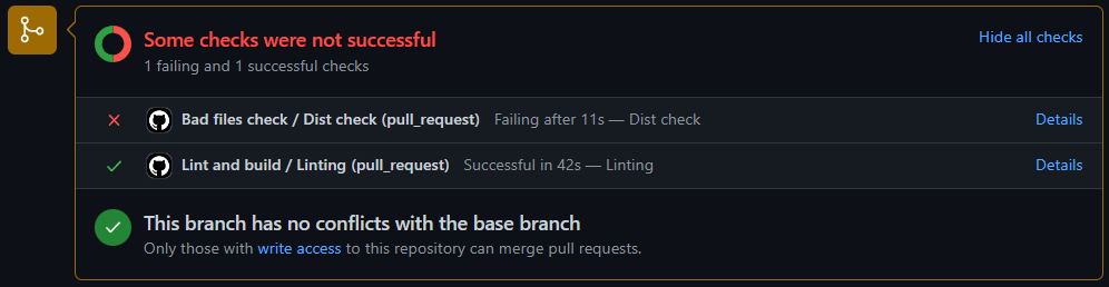
When you submit a pull request to make changes in Tabulator, there are now some automated GitHub actions that will automatically run validation checks against your code to ensure it meets the ESLint code formatting requirements before it will allow the PR to be merged.
If the linter picks up an issues with submitted code, you will see the failures listed in a report at the bottom of the Conversation tab of the PR. You will need to fix each of the issues before the PR is approved for merging.
Spelling Review
The spelling of all words in the source code has been reviewed. This largley resulted in a lot of spelling tweaks to comment lines but has also resulted in the changing of several internal function names. This shouldn't directly affect any external API's of Tabulator, but may affect you if you have a customized fork of the library.
SCSS Variables
As part of the spelling review a number of the SCSS variable have been adjusted to their correct spelling, for a full list of changed variable names, checkout the upgrade guide.
Debug Tools
By default Tabulator provides a range of console warnings to flag to a developer that something may be wrong with the configuration of the table. In this release a couple of new setup options have been added to disabled these warnings if necessary.
Invalid Component Functions Warnings
Enabled by default, this will provide a console warning if you are trying to call a function on a component that does not exist. With the new optional modular structure this is particularly valueable as it will prompt you if you are trying to use an function on a component for a module that has not been installed
You can disable this using the debugInvalidComponentFuncs option in the table constructor:
var table = new Tabulator("#example-table", {
    debugInvalidComponentFuncs:false, //disable component function warnings
});
Deprecation Warnings
Enabled by default, this will provide a console warning if you attempt to use a setup option that has been deprecated. Where possible an alternative option may be suggested
You can disable this using the debugDeprecation option in the table constructor:
var table = new Tabulator("#example-table", {
    debugDeprecation:false, //disable deprecation warnings
});
Performance Improvements
Column Manipulation
The internal column manager has been updated to improve performance of column rendering.
Actions that result in a column being redrawn, such as toggling visibility, updating definitions adding columns and deleting columns will now function in a fraction of the time they used to, and will now take a consistent amount of time regardless of how may columns the table contains.
Redraw Blocking
The blockRedraw and restoreRedraw functions have now been updated to affect columns as well as rows. This will allow for fast manipulation of multiple columns while only triggering on redraw of the table, allowing for much faster bulk updates.
table.blockRedraw(); //block table redrawing

table.getColumns().forEach((col) => {
    col.updateDefinition({contextMenu:false}) //update the cell definition in some way
});

table.restoreRedraw(); //restore table redrawing
Row Position
The row positioning system used by the gerPosition functionality has been overhauled in this release.
In previous releases, the row posiition was calculated from the unfilterd, un-layed out data, which was fine for simple tables, but when using grouped data or data trees resulted in positions and row numbers that did not match the actual position of the row in the visible table.
In this release row position is now calculated based on a rows display position in the table, and is based only on actual rows, group headers, frozen and calculation rows are excluded from the position data to keep row numbering consistent for actual rows.
The position of each row now also reflects their row number as shown in the rownum formatter, so that there is consitentcy between the row number shown to the user and the ros position. As a result of this row positions now start at 1 instead of 0.
As a result of this rows that are not currently displayed in the table, i.e. they have been filtered out, or are part of collapsed groups or collapsed data trees, no longer have a position as they are not curently part of the display calculations. In these cases a value of false will be returned from any position function to indicate the row is not currently displayed and has no position information.
Getting a Rows Position
Get Position From Table
Use the getRowPosition function to retrieve the numerical position of a row in the table.
The first argument is the row you are looking for, it will take any of the standard row component look up options.
var position = table.getRowPosition(row); //return the position of the row in the filtered/sorted data
This function will only return the position of a row currently displayed in the table. if the row is currently filtered out or is part of a collapsed group or data tree, this will return a value of false
Get Position From Component
Use the getPosition function to retrieve the numerical position of a row in the table.
var rowPosition = row.getPosition(); //return the position of the row in the filtered/sorted data
This function will only return the position of a row currently displayed in the table. if the row is currently filtered out or is part of a collapsed group or data tree, this will return a value of false
Retreive Row By Position
You can retrieve the Row Component of a row at a given position in the table using getRowFromPosition function. By default this will return the row based in its position in all table data, including data currently filtered out of the table.
var row = table.getRowFromPosition(5); //return 5th row in the visible table data
Watch For Position Change
You can use the watchPosition function on a Row Component to register a callback that is triggered when that rows position changes, this is particularly useful for formatters that are dependent on a rows position.
row.watchPosition((position) => {
    //position - the new position of the row
});
Frozen Rows
The frozen rows module has had an overhaul in this release. It now offers a number of different table setup options to make freezing rows ate the top of the table really easy.
Freeze a Fixed Number of Rows
If you set the frozenRows table setup option to an integer value then that many rows of data will be frozen at the top of the table. In the example below we will freeze the first two rows of data:
var table = new Tabulator("#example-table", {
    frozenRows:2, //freeze first two rows of data
});
Freeze Rows by Field Value
You can use a combination of the frozenRows and frozenRowsField table setup options to freeze rows based on the value of a particular field in their row data.
Define the field you want to look at in the frozenRowsField option (this defaults to "id" if not set) and then set an array of values to compare against in the frozenRows option.
In the example below we will freeze any rows with a color value of "red" or "green":
var table = new Tabulator("#example-table", {
    frozenRowsField:"color", //freeze first two rows of data
    frozenRows:["red", "green"], //freeze first two rows of data
});
Freeze Rows by Function
For more advanced usage cases where you may need some custom logic to decide which rows are frozen, you can pass a function to the frozenRows option. This function will be called on each row in the table, it will be passed the Row Component for the row as its first argument and should return true if the row is to be frozen:
var table = new Tabulator("#example-table", {
    frozenRows:function(row){
        return row.getData().name.length < 10 // freeze all rows with a name less than 10 characters long
    },
});
Freeze Rows Using The Component
You can freeze a row at the top of the table by calling the freeze function on the Row Component of any row. This will insert the row above the scrolling portion of the table in the table header.
row.freeze();
A frozen row can be unfrozen using the unfreeze function on the Row Component of any row. This will remove the row from the table header and re-insert it back in the table.
row.unfreeze();
Note: Freezing or unfreezing a row will redraw the table.
Editing
Textarea Editor
A new shiftEnterSubmit option has been added to the editorParams of the textarea editor to allow submission of the value of the editor when the shift and enter keys are pressed togeather.
{title:"Example", field:"example", editor:"textarea", editorParams:{
    shiftEnterSubmit:true, //submit cell value on shift enter
}}
Date
The new date editor allows for editing of a date using a standard date type input field. This intended as a simple date picker, if you are looking for advanced date management functionality then it is recomended that you build a custom editor using an external date picker library.
{title:"Example", field:"example", editor:"date", editorParams:{
    min:"01/01/2020", // the minimum allowed value for the date picker
    max:"02/12/2022", // the maximum allowed value for the date picker
    format:"dd/MM/yyyy", // the format of the date value stored in the cell
    elementAttributes:{
        title:"slide bar to choose option" // custom tooltip
    }
}}
The editor has optional properties for the editorParams object:
- min - the minimum value for the progress bar defaul format is yyyy-mm-dd, if the format param is used then it will expect the date in that format instead
- max - the minimum value for the progress bar defaul format is yyyy-mm-dd, if the format param is used then it will expect the date in that format instead
- format - the format for the date to be stored in the table. This accepts any valid Luxon format string, or the value "iso" which accept any ISO formatted data. If the input value is a luxon DateTime object then you should set this option to true. If this value param is ignored then the data should be in the format YYYY-MM-DD(this will not affect the format the user has to enter the data into the table, that is determined by the browser)
- elementAttributes - set attributes directly on the progress holder element
Browser Styling
Because this editor uses the default date type input element, it is up to each browser to choose how the date picker will function and be styled, which may lead to an inconsistent look and feel. If you need consistent functionality across browsers then it recomended that you make a custom editor using an external date picker library.
Time
The time editor allows for editing of a time using a standard time type input field. This intended as a simple time picker, if you are looking for advanced time management functionality then it is recomended that you build a custom editor using an external time picker library.
{title:"Example", field:"example", editor:"time", editorParams:{
    format:"hh:mm:ss", // the format of the time value stored in the cell
    elementAttributes:{
        title:"slide bar to choose option" // custom tooltip
    }
}}
The editor has optional properties for the editorParams object:
- format - the format for the time to be stored in the table. This accepts any valid Luxon format string, or the value "iso" which accept any ISO formatted data. If the input value is a luxon DateTime object then you should set this option to true. If this value param is ignored then the data should be in the format hh:mm(this will not affect the format the user has to enter the data into the table, that is determined by the browser)
- elementAttributes - set attributes directly on the progress holder element
Browser Styling
Because this editor uses the default time type input element, it is up to each browser to choose how the time picker will function and be styled, which may lead to an inconsistent look and feel. If you need consistent functionality across browsers then it recomended that you make a custom editor using an external time picker library.
Date Time
The datetime editor allows for editing of a date and time using a standard datetime type input field. This intended as a simple date-time picker, if you are looking for advanced date-time management functionality then it is recomended that you build a custom editor using an external date-time picker library.
{title:"Example", field:"example", editor:"datetime", editorParams:{
    format:"dd/MM/yyyy hh:mm", // the format of the date value stored in the cell
    elementAttributes:{
        title:"slide bar to choose option" // custom tooltip
    }
}}
The editor has optional properties for the editorParams object:
- format - the format for the date-time to be stored in the table. This accepts any valid Luxon format string, or the value "iso" which accept any ISO formatted data. If the input value is a luxon DateTime object then you should set this option to true. If this value param is ignored then the data should be in the format YYYY-MM-DDThh:mm(this will not affect the format the user has to enter the data into the table, that is determined by the browser)
- elementAttributes - set attributes directly on the progress holder element
Browser Styling
Because this editor uses the default datetime-local type input element, it is up to each browser to choose how the date-time picker will function and be styled, which may lead to an inconsistent look and feel. If you need consistent functionality across browsers then it recomended that you make a custom editor using an external date-time picker library.
Importers
Array Importer
The new array importer has been added that will allow loading of row data structured as array of row arrays, with each element in the row array representing a columns data, it is intended for use loading JavaScript arrays of arrays into the table, not JSON formatted strings.
//define some array data
var arrayData = [
  ["Name", "Age", "Likes Cheese"], //column header titles
  ["Bob", 23, true],
  ["Jim", 44, false],
]

//define table
var table = new Tabulator("#example-table", {
    data:arrayData,
    importFormat:"array",
    autoTables:true,
});
Auto Columns
If the autoColumns option is enabled on the table, then the first row of the CSV data should be the column titles.
Sorting
Custom Sort Icons
The existingheaderSortElement option can now accept a callback that is called every time a sorter is changed and allows you to set a different icon for each column sort state:
var table = new Tabulator("#table", {
    headerSortElement: function(column, dir){
        //column - column component for current column
        //dir - current sort direction ("asc", "desc", "none")

        switch(dir){
            case "asc":
                return "<i class='fas fa-sort-up'>";
            break;
            case "desc":
                return "<i class='fas fa-sort-down'>";
            break;
            default:
                return "<i class='fas fa-sort'>";
        }
    },
});
Download
Column Visibility
The download option in the column definition can now be passed a callback function that will be called when a download is started, this function is passed in the Column Component of the column and should return a boolean indicating the visibility of the column in the download.
var table = new Tabulator("#example-table", {
    columns:[
        {title:"id", field:"id", download:function(column){
            //column - column component for current column

            return true; //make column visible in download
        }}
    ]
});
Output Encoding
The downloadReady function has been replaced in this release with a new function, downloadEncoder, that passes in more information and allows you to take direct control over the encoded output of the downloader.
The first argument of the function is the file contents returned from the downloader, the second argument is the suggested mime type for the output. The function is should return a blob of the file to be downloaded.
var table = new Tabulator("#example-table", {
    downloadEncoder:function(fileContents, mimeType){
        //fileContents - the unencoded contents of the file
        //mimeType - the suggested mime type for the output

        //custom action to send blob to server could be included here

        return new Blob([fileContents], {type:mimeType}); //must return a blob to proceed with the download, return false to abort download
    }
});
As before, if you would prefer to abort the download you can return false from this callback. This could be useful for example if you want to send the created file to a server via ajax rather than allowing the user to download the file.
Clipboard
Column Visibility
The clipboard option in the column definition can now be passed a callback function that will be called when a clipboard copy is started, this function is passed in the Column Component of the column and should return a boolean indicating the visibility of the column in the clipboard data.
var table = new Tabulator("#example-table", {
    columns:[
        {title:"id", field:"id", clipboard:function(column){
            //column - column component for current column

            return true; //make column visible in clipboard data
        }}
    ]
});
Column Visibility
The print option in the column definition can now be passed a callback function that will be called when a print is started, this function is passed in the Column Component of the column and should return a boolean indicating the visibility of the column in the printed table.
var table = new Tabulator("#example-table", {
    columns:[
        {title:"id", field:"id", print:function(column){
            //column - column component for current column

            return true; //make column visible in printed table
        }}
    ]
});
HTML Export
Column Visibility
When xporting table data using the getHtml function, the htmlOutput option in the column definition can now be passed a callback function that will be called when the export is started, this function is passed in the Column Component of the column and should return a boolean indicating the visibility of the column in the exported table.
var table = new Tabulator("#example-table", {
    columns:[
        {title:"id", field:"id", htmlOutput:function(column){
            //column - column component for current column

            return true; //make column visible in exported table
        }}
    ]
});
Events
Several new external events have been added in this release
Table Destroyed
When a table has been destroyed by calling the destroy function, the tableDestroyed event will triggered when all internal functionality has been destroyed and just before all external event listeners are removed from the table:
table.on("tableDestroyed", function(){});
Internal Events
Redraw Events
Several new internal events have been added to help modules handle changes to the table redraw status.
Redraw Blocking
The redraw-blocking event is a dispatch type event, that is triggered when the redrawBlock function has been called but before the column and row managers have blocked redrawing
this.subscribe("redraw-blocking", function() => {
    //do something
});
Redraw Blocked
The redraw-blocked event is a dispatch type event, that is triggered when the redrawBlock function has been called, after the column and row managers have blocked redrawing
this.subscribe("redraw-blocked", function() => {
    //do something
});
Redraw Restoring
The redraw-restoring event is a dispatch type event, that is triggered when the redrawRestore function has been called but before the column and row managers have restored redrawing
this.subscribe("redraw-restoring", function() => {
    //do something
});
Redraw Restored
The redraw-restored event is a dispatch type event, that is triggered when the redrawRestore function has been called, after the column and row managers have restored redrawing
this.subscribe("redraw-restored", function() => {
    //do something
});
Styling
New Classes
Table Editing
When a cell is being edited, the tabulator-editing class is now applied to the tables containing element along with the tabulator class. This should aid in styling the current table that is being edited if needed.
Row Editing
When a cell is being edited, the tabulator-editing is now applied to the row instead of the old tabulator-row-editing class. This class name has been changed to improve the consistency of class naming.
Editable Cells
When a cell is editable, the tabulator-editable class is now applied to the cell. this should allow for easy styling of only editable cells.
Bug Fixes
v5.3.0 Release
The following minor updates and bugfixes have been made:
- Fixed ordering issues in the array sorter
- Fixed issue in value filtering logic in list editor
- The list editor now correctly highlights current values in the list when used as a header filter with the multiselect option enabled
- The listOnEmpty option for the list editor now works correctly
- Fixed issue with list editor loosing focus on mobile when keyboard is displayed causing page resize
- Fixed issue with clear button in list editor not allowing access to input
- The float and integer validators now correctly invalidate symbolic strings
- Fixed exception thrown when exporting html with either the getHTML function or the html downloader with no style attribute set
- The getGroups function now correctly returns an empty array after row grouping has been disabled by the setGroupBy function
- Fixed regression in movable rows module when moving grouped rows
- Fixed issue with recursive loop in reactive data module when the watched data array is updated
- Frozen column and frozen row functionality can now work at the the same time without visual corruption
- It is no longer possible to erroniously drag a movable row beyond the bottom of the table
- Fixed layout glitch when using bottom column calculations and scrolling in rtl mode
- Fixed regression with fitData layout mode, causing the column widths to be reset on table resize or visibility change
- Filtering the table to 0 results while using the virtual vertical renderer will no longer incorrectly reset the horizontal scroll position
- Fix horizontal scroll bar positioning issue when minHeight is set in table options
- Fixed issue with progress formatter nor respecting the hozAlign column definition option
- Fixed exception thrown when destroy function is called on table.
- Non fixed height tables now correctly recalculate their height after render pipeline is updated
- Fix issue with remtote mode paginated tables gaining uneeded horizontal scroll bar after data is loaded into the table from an empty state
v5.3.1 Release
The following minor updates and bugfixes have been made:
- Fixed regression in list editor deprecated functionality check
- Prevent list editor blur when mobile keyboard is shown
- Removed unessisary console logging from the list editor
- Fixed issue with column calculation updates when new row added while row grouping is enabled
- Fixed issue with data tree row parent lookup on uninitialized rows
- Console warning will now be displayed if a columns maxWidth is set to be smaller than its minWidth
- Added compatibility console warning for the dataTree option and movableRows
- Fixed issue when a grouped row is deleted when the history module is in use
- Fixed issue with the interaction monitor not correctly identifying which column header had been clicked when using grouped columns
- When finding a column based off its DOM element, grouped columns are now correctly traversed to find matching child columns
- Fixed width calculation rounding issue in fitColumns layout function that resulted in horizontal scrollbar appearing
- Double clicking on a non-editable cell now correctly selects only the contents of that cell rather than the entire row
- fixed issue with internal render mode check not returning current render mode
- Row group visibility toggles now function correctly with the basic vertical renderer
- Collapsed row data is now correctly updated when row data is updated
v5.3.2 Release
The following minor updates and bugfixes have been made:
- Fixed issue with unresolved promise returned from updateData function when data has a length of 0
- Fixed issue with table attempting to redraw data while it is being destroyed
- Interaction events in child nested tables no longer cause an exception in the parent table when triggered
- Using the headerSortElement option with the headerSort column definition option no longer causes an exception
- Double clicking on editable cells no longer prevent editing of cell contents
- Calling the moveColumn function on the table no longer breaks column resize handle positioning
- The columnHeaderSortMulti option and the headerSortTristate column definition options now work correctly together
- Fixed issue with row display pipeline not correctly persisting first registered pipeline handler
v5.3.3 Release
The following minor updates and bugfixes have been made:
- Removed legacy display index functionality from modules
- Fixed scope issue in persistence module when tracking column definition props
- Making changes to the table now works without exception after disabling grouping by passing a value of false to the setGroupBy function
- The column headers now correctly maintain their height when only frozen columns are visible
- Table holder min-width is now correctly cleared when the empty table placeholder is removed
- Update getRows function to return an empty array when an invalid row range lookup value is used
- Fix issue with row selection on an invalid string type index causing all rows to be selected
- Striping of rows in the bootstrap themes is correctly applied when the table-striped class is applied to the table
v5.3.4 Release
The following minor updates and bugfixes have been made:
- Fixed regression in row lookup functionality that prevented the legacy value of true from returning the current rows array
- The minimum table holder width is now correctly removed even if no placeholder is set
- Minimum column header height is now correctly applied to the headers container element rather than the header element, which was hiding frozen rows
- Frozen rows are now visible on paginated tables with no height set
Version 5.2 Release Notes
Initialization
Initialization
As of version 5.0 Tabulator has moved to using an asynchronous initialization process, allowing a consistent initialization experience between async and synchronous data sources, also allowing binding of the events system to the table before initialization is completed.
The result of this is that you cannot safely call most functions directly on the table before it has finished initializing, when the tableBuilt event has fired.
This has resulted in confusion with some developers when migrating from older versions, as some functionality appears to break without warning.
A console warning message has now been added to all module and table functions that could cause issues if called when the table is initializing.
Initialization Warning
Enabled by default this will provide a console warning if you try and call an unsafe function on the table before it has been initialized.
You can disable this using the debugInitialization option in the table constructor
var table = new Tabulator("#example-table", {
    debugInitialization:false, //disable option warnings
});
Module Building
Initialization Order
When building a custom module, the optional moduleInitOrder property can be used to determine the order in which the module is initialized, by default modules are initialized with a value of 0, if you want your module to be initialized before other modules use a minus number, if you want it inialized after use a positive number.
CustomModule.moduleInitOrder = 10;
Popups
A new internal popup management tool has been added to the Module class to ensure a consistent behaviour and look and feel when creating popup elements for things like menus, tooltips, popups and editors.
To use the popup system you must first build up an element containing the contents of your popup. You then pass this to the popup function on the module, which will return an instance of a Popup class that you can then control with a range of functions:
// Build popup contents
var tooltipContents = document.createElement("div");
tooltipContents.classList.add("tabulator-tooltip");
tooltipContents.innerHTML = "Hey, im a tooltip!";

// Create instance of tooltip
var popup = this.popup(tooltipContents);
Popup Positioning
By default Tabulator will append the popup element to the body element of the DOM as this allows the popup to appear correctly in the vast majority of situations.
There are some circumstances where you may want the popup to be appended to a different element, such as the body of a modal, so that the popup is contained with that element.
In these circumstances you can use the popupContainer option to specify the element that the popup should be appended to.
var table = new Tabulator("#example-table", {
    popupContainer:"#modal-div", //append popup to this element
});
The popupContainer option can accept one of the following values:
- false - Append popup to the body element (default)
- true - Append popup to the table
- CSS selector string - A valid CSS selector string
- DOM node - A DOM Node
If Tabulator cannot find a matching element from the property, it will default to the document body element.
Container Position
popup elements are positioned absolutely inside their container. For this reason you must make sure that your container has its position defined in CSS
Parent Element
The element you pass into the popupContainer option must be a parent of the table element or it will be ignored
Show Popup
When you are ready to show your popup, you need to call the show function on the popup instance. This function takes its destination as its first argument, which can be one of three types.
Show By Event
If a user is triggering the popup by an event such as a touch or click then you can pass this event to the show function and Tabulator will then place the element with its top left corner at the point of the click event.
popup.show(e);
Show By Element
If you want to show a popup aligned with another element on the table, pass the element itself into the show function and Tabulator will then align the popup with that element. This option is particularly useful when loading submenus, if you pass the element that was clicked on the child element can be aligned with the list item that spawned it.
The first argument is the element to align the popup with, The second argument is optional and is the side of the element to align the popup with, this should be a string and can either be right or bottom. if you leave this value out it will default to right
popup.show(element, "below");
Show By Coordinates
If you want to specify the exact x and y coordinates that the popup should be shown, these can be passed in as the first and second arguments of the show function.
popup.show(200, 250);
It is worth noting that these coordinates are relative to the position of the tables containing element as set on the table popupContainer option. (Defaults to document body)
Hide Popup
To hide a visible popup, call the hide function on the popup instance.
popup.hide();
If the menu has any children, these will also be hidden
Hide Popup On Blur
If you would like your popup to automatically close when it looses focus, you can call the hideOnBlur function immediatly after showing the popup.
popup.show().hideOnBlur();
This function only needs to be called on the parent popup, all other children popups will automatically be hidden when the parent is hidden.
You can optionally pass a callback into the hideOnBlur function that will be triggered when the menu is hidden
popup.show().hideOnBlur(() => {
    //do something
});
Popup Children
If you are building out a navigatable menu system, then you can sometimes want child menus to be spawned from the parent.
Once a popup is visible, if you need to add chidren you can call the child function, passing in the element containing the child menu, this will return a new popup instace for the child that is linked to the parent so if the parent is hidden the child will be too, but not the other way round.
You can then call the show function on the child passing the element inside the parent that called it, the child element will then be positioned relative to that element.
// Build popup contents
var menu = document.createElement("ul");
menu.classList.add("tabulator-menu");

// Create instance of menu
var popup = this.popup(tooltipContents);

// Generate menu items
for(let i=1 ; i<5 ; i++){
    let item = document.createElement("li");
    item.innerHTML = "Item " + i;

    // Open child menu on click
    item.addEventListener("click", (e) => {
        //create child menu
        var childMenu = document.createElement("div");
        childMenu.classList.add("tabulator-menu");
        childMenu.innerHTML = "Hey, im a menu!";

        //create child and show next to the parent menu item;
        popup.child(childMenu).show(item);
    });
}

// Show menu
popup.show(25, 15);
Single Child Limit
A popup can only have one direct child (children can have children of their own), adding a second direct child to a popup will close the first automatically. in the same way that you can only look at one submenu of a list at the same time.
Popup Function Chaining
Once you have your popup instance, you can then call a range of functions on it to control how it behaves.
Functions can be chained one after the other to make things simpler if needed.
popup.show(200, 150).hideOnBlur();
Alerts
Access to the internal table alert functionality has been added to the Module class to allow modules to more directly message users when needed.
Alerts provide full table modal take over messages, with a semi transparent full table sized backgound and a centered message. These are used for example to show a loading message when the table is loading remote data via ajax request.
Showing an Alert
To show an alert, call the alert function on the module. Passing the message into the first argument of the function.
this.alert("This is an alert!");
The alert function will accept one of several diffrent types alert:
- string - A text string or valid HTML content for the alert
- DOM node - A DOM Node of the element to be included inside the alert
Alert Styles
The alert function also provides a way to style the alert message being presented to the user. There are two built in styles:
- msg - A black border with black text (default)
- error - A red border with red text
You can pass the style into the optional second argument of the alert function:
this.alert("This is an alert!", "error");
Behind the scenes this works by applying the tabulator-alert-state-error class to the .tabulator-alert-msg element. You can therefor provide any string you like to the second argument and then use it to apply custom styles to the alert.
For example if we passed a value of warning to the second argument of the alertfunction the tabulator-alert-state-warning class to the .tabulator-alert-msg element
Clearing an Alert
To clear an active alert, call the clearAlert funtion on the this.
this.clearAlert();
Footer Manager
The footer manager has been decoupled from the modules that use the footer, making it more extensible and easier to manage.
As a result there are now three new functions available to modules to aid in manipulating the table footer.
Append Element
The footerAppend function will append an element to the flex aranged area at the bottom of the footer. each element added to the footer will be spaced out with the other elements. (this is used by the pagination module to add pagination controls)
    var button = document.createElement("button");
this.footerAppend(button); //Append button to footer
Prepend Element
The footerPrepend function will prepend an element to above the flex aranged area at the bottom of the footer. (This is used by the column calculations module to add the bottom calcs row)
var label = document.createElement("label");
this.footerPrepend(label); //Prepend button to top of footer
Remove Element
The footerRemove function will remove an element that has previously been added to the footer
var label = document.createElement("label");
this.footerPrepend(label); //Prepend label to top of footer
this.footerRemove(label); //Remove label from footer
Themes
Bootstrap 5
This release includes a new theme for the v5 release of the bootstrap framework
This can be included from the dist folder at /dist/css/tabulator_bootstrap5.min.css
Resizable Columns
The ResizeColumns module has been completely rebuilt for this release.
Cell resize handles are now appended between cells in the row using negative margins to shift them over the cells themselves. This allows for continuous resize handles that are not interrupted by the cells borders.
As a result of the resize handles should now render correctly in scenarios where some columns are not resizable, with handles only being shown on columns that can be resized.
The module has also hads its efficiency improved, only binding to internal table events when it detects that a column is resizabe.
Maintain Column Fit When Resizing
If the resizableColumnFit table definition option is set to true, then when you resize a column its neighbouring column has the opposite resize applied to keep to total width of columns the same.
var table = new Tabulator("#example-table", {
    resizableColumnFit:true, //maintain the fit of columns when resizing
    columns:[
        {title:"Name", field:"name", resizable:true}
    ]
});
Resize Overflow
It is worth noting that should the neighbouring column reach is max or min width while the reszie is occurring, that the next column over will then begin to resize in its place. If the resize runs out of columns then the total width of all the columns will change.
Mutators
Linked Mutators
You may want to make a column that calculates its value based on the value of other columns, for example:
[
    {title:"a", field:"a"},
    {title:"b", field:"b"},
    {title:"c", field:"c", mutator:function(value, data){
        return data.a + data.b;
    }},
]
In this case it is likely that you would want the value in column c to be updated when the user changes the value in columns a or b. But this wont happen by default. Mutators are only run when the data is initially loaded into the table, and when the value of a specific cell is changed.
To keep processing to a minimum, Tabulator will only run mutators on cells with changed values, not all cells in a row.
You can use the mutateLink option on a column definition to tell it to trigger the mutation of another column when its value has changed. You can pass in a string of the field name of the column to be mutated, or an array of field name strings if you want more than one mutator triggered.
[
    {title:"a", field:"a", editor:"number", mutateLink:"c"}, //trigger "c" column mutator when edited
    {title:"b", field:"b", editor:"number", mutateLink:"c"}, //trigger "c" column mutator when edited
    {title:"c", field:"c", mutator:function(value, data){
        return data.a + data.b;
    }},
]
Pagination
Events
Page Size Changed
Whenever the page size of the table is set or changed the pageSizeChanged event is called, passing the number of rows per page as an argument.
table.on("pageSizeChanged", function(pagesize){
    //pagesize - the number of rows per page
});
Menus
Menu Container
As a result of the introduction of the built in popup functionality in this release, the menu module is no longer responsible for creation of its own popups.
For this reason the module specific menuContainer has been replaced with the table wide popupContainer option.
var table = new Tabulator("#example-table", {
    popupContainer:true, //show menus and other popups relative to the table element
});
Column Header Menu Icon
When you insert a header menu, Tabulator will add a button to the header element with an ⋮ icon. You can now change the contents of this button using headerMenuIcon column definition option
The headerMenuIcon option will accept one of three types of value. You can pass in a string for the HTML contents of the button
{title:"Name", field:"name", headerMenuIcon:"<i class='fas fa-filter'></i>", headerMenu:headerMenu}
Or you can pass the DOM node for the button. Though be careful not to pass the same node to multple columns or you may run into issues.
//define element
var buttonContents = document.createElement("span");
buttonContents.innerText = "Filter";

//column definition
{title:"Name", field:"name", headerMenuIcon:buttonContents, headerMenu:headerMenu}
Or you can define a function that is called when the column header is rendered that should return either an HTML string or the contents of the element. This funtion is passed the column component as its first argument
{title:"Name", field:"name", headerMenuIcon:function(component){
    //component - column component for header

    return "<i class='fas fa-filter'></i>";
}}
Popups
A new Popup module has been added in this release. Popups work in a similar way to menus, but instead of only displaying lists of menu items then allow you to fill them with any custom content you like, text, input elements, forms, anything you fancy.
The example below has two type of popup, if you click on a row you will see a popup with more row details, and if you click on the filter icon in the column header you will see a popup that lets you filter the column data:
Defining a Popup
When definind a popup you can pass one of three types of value into the option. You can pass in a string for the HTML contents of the button
{title:"Name", field:"name", clickPopup:"Hey, Im a Popup!"}
Or you can pass the DOM node for the button. Though be careful not to pass the same node to multple columns or you may run into issues.
//define element
var popupContents = document.createElement("span");
popupContents.innerText = "Hey Im a Popup!";

//column definition
{title:"Name", field:"name", clickPopup:popupContents}
Or you can define a function that is called when the popup is rendered that should return either an HTML string or the contents of the element. This funtion is passed the mouse/touch event as its first argument and the component of the element that triggered the popup as the second argument
{title:"Name", field:"name", clickPopup:function(e, component, onRendered){
    //e - the mouse/touch event that triggered the popup
    //component - column/row/cell component that triggered this popup
    //onRendered - function to call when the formatter has been rendered

    return "Hey Im a Popup!";
}}
The onRendered callback function passed into the third argument allows you to register a callback that will be triggered when the popup has been added to the DOM but before its position is confirmed. This can be useful when you are trying to use a 3rd party library that needs the element to be visible before it can be instatiated
To use this function you need to pass a callback that runs any of your required code as the only argument. The example below uses the jQuery sparkline widget to add a small chart to the popup
{title:"Name", field:"name", clickPopup:function(e, component, onRendered){
    //e - the mouse/touch event that triggered the popup
    //component - column/row/cell component that triggered this popup
    //onRendered - function to call when the formatter has been rendered

    var element = document.createElement("div");

    onRendered(function(){
        $(element).sparkline(component.getValue(), {width:"100%", type:"bar"});
    });

    return element;
}}
Close On Blur
Popups will automatically close when focus on the popup element is lost.
Column Header Popups
Column Header Popup
You can add a popup to any column by passing the popup contents to the headerPopup option in that columns definition.
Adding a header popup will cause a ⋮ button to appear to the left of the column header title. clicking on this button will open the popup.
var table = new Tabulator("#example-table", {
    columns:[
        {title:"Name", field:"name", headerPopup:"Im a Popup"}, //add popup button to this column header
    ]
});
Column Header Popup Icon
When you insert a header popup, Tabulator will add a button to the header element with an ⋮ icon. You can change the contents of this button using headerPopupIcon column definition option
The headerPopupIcon option will accept one of three types of value. You can pass in a string for the HTML contents of the button
{title:"Name", field:"name", headerPopupIcon:"<i class='fas fa-bars'></i>"}
Or you can pass the DOM node for the button. Though be careful not to pass the same node to multple columns or you may run into issues.
//define element
var buttonContents = document.createElement("span");
buttonContents.innerText = "Popup";

//column definition
{title:"Name", field:"name", headerPopupIcon:buttonContents}
Or you can define a function that is called when the column header is rendered that should return either an HTML string or the contents of the element. This funtion is passed the column component as its first argument
{title:"Name", field:"name", headerPopupIcon:function(component){
    //component - column component for header

    return "<i class='fas fa-bars'></i>";
}}
Column Header Context Popup
You can add a right click popup to any column by passing the popup contents to the headerContextPopup option in that columns definition.
var table = new Tabulator("#example-table", {
    columns:[
        {title:"Name", field:"name", headerContextPopup:"Im a Popup"}, //add context popup to this column header
    ]
});
Mobile Devices
When used on a mobile device the context menu will be triggered by a long press on the element
Row Popups
Row Click Popup
You can add a click popup to any row by passing the popup contents to the rowClickPopup option in the table constructor object.
var table = new Tabulator("#example-table", {
    rowClickPopup:"Im a Popup"
});
Row Context Popup
You can add a right click popup to any row by passing the popup contents to the rowContextPopup option in the table constructor object.
var table = new Tabulator("#example-table", {
    rowContextPopup:"Im a Popup"
});
Mobile Devices
When used on a mobile device the context menu will be triggered by a long press on the element
Cell Popups
Cell Click Popup
You can add a click popup to any cell by passing the popup contents to the clickPopup option in that columns definition.
var table = new Tabulator("#example-table", {
    columns:[
        {title:"Name", field:"name", clickPopup:"Im a Popup"} //add cell click popup
    ]
});
Cell Context Popup
You can add a right click popup to any cell by passing the popup contents to the contextPopup option in that columns definition.
var table = new Tabulator("#example-table", {
    columns:[
        {title:"Name", field:"name", contextPopup:"Im a Popup"} //add cell context popup
    ]
});
Group Popups
Group Header Click Popup
You can add a click popup to any group header by passing the popup contents to the groupClickPopup option in the table constructor object.
var table = new Tabulator("#example-table", {
    groupClickPopup:"Im a Popup"
});
Group Header Context Popup
You can add a right click popup to any group header by passing the popup contents to the groupContextPopup option in the table constructor object.
var table = new Tabulator("#example-table", {
    groupContextPopup:"Im a Popup"
});
Popup Events
A couple of popup events have been added to help track when popup functionality is in use
Popup Opened
The popupOpened callback is triggered when a popup is opened.
table.on("popupOpened", function(component){
    //component - the component the popup has been opened on (could be cell, row or column depending on popup)
});
Popup Closed
The popupClosed callback is triggered when a popup is closed.
table.on("popupClosed", function(component){
    //component - the component the popup has been closed for (could be cell, row or column depending on popup)
});
Tooltips
Tooltip functionality has been moved into its own module, and now uses the internal table popup functionality to generate tooltips instead of the browser based title attribute on the cell elements.
The major benifit of this approach is that tool tips are now fully customisable, you can style them as you like using the new tabulator-tooltip class, and they now support full HTML content.
Tooltip Generation Mode
As a result of this migration the tooltipGenerationMode table option has been removed as tooltips are now always generated at the moment they are displayed.
Cell Tooltips
You can set tooltips to be displayed when the cursor hovers over cells, these can contain any value and be formatted in any way you like.
Tooltips can either be set per column in the column definition object
//column definition object in the columns array
{title:"Name", field:"name", tooltip:true},
Or globally in the columnDefaults object:
var table = new Tabulator("#example-table", {
    columnDefaults:{
        tooltip:true,
    }
});
The tooltip parameter can take three different types of value
- boolean - a value of false disables the tooltip, a value of true sets the tooltip of the cell to its value
- string - a string that will be displayed for all cells in the matching column/table.
- DOM Node - a DOM node for the tooltip
- function - a callback function that returns either the html/text contents for the tooltip, or a DOM node for the contents of the tooltip:
The function accepts three arguments, the first is the mouseover event object that triggered the tooltip, the second is CellComponent for the cell the tooltip is being generated for, the third argument is the onRendered function that allows you to register a callback that will be triggered when the popup has been added to the DOM but before its position is confirmed.
This function will also allow you to style the tooltip by applying styles to the returned element if desired
var table = new Tabulator("#example-table", {
    columnDefaults:{
        tooltip:function(e, cell, onRendered){
            //e - mouseover event
            //cell - cell component
            //onRendered - onRendered callback registration function

            var el = document.createElement("div");
            el.style.backgroundColor = "red";
            el.innerText = cell.getColumn().getField() + " - " + cell.getValue(); //return cells "field - value";

            return el;
        },
    }
});
Column Header Tooltips
It is also possible to set tooltips to display on the column headers. This is particularly useful when your columns are too narrow to display full header names.
Header tooltips can either be in a columns definition object:
//column definition object in the columns array
{title:"name", field:"name", headerTooltip:true},
The tooltip headerTooltip can take three different types of value
- boolean - a value of false disables the tooltip, a value of true sets the tooltip of the column header to its title value.
- string - a string that will be displayed for the tooltip.
- DOM Node - a DOM node for the tooltip
- function - a callback function that returns either the html/text contents for the tooltip, or a DOM node for the contents of the tooltip:
The function accepts three arguments, the first is the mouseover event object that triggered the tooltip, the second is ColumnComponent for the column header the tooltip is being generated for, the third argument is the onRendered function that allows you to register a callback that will be triggered when the popup has been added to the DOM but before its position is confirmed.
This function will also allow you to style the tooltip by applying styles to the returned element if desired
var table = new Tabulator("#example-table", {
    columnDefaults:{
        headerTooltip:function(e, cell, onRendered){
            //e - mouseover event
            //cell - cell component
            //onRendered - onRendered callback registration function

            var el = document.createElement("div");
            el.style.backgroundColor = "red";
            el.innerText = column.getDefinition().title;

            return el;
        },
    }
});
Alerts
This release provides access to Tabulators alert system. Alerts provide full table modal take over messages, with a semi transparent full table sized background and a centered message. These are used for example to show a loading message when the table is loading remote data via ajax request.
Showing an Alert
To show an alert, call the alert function on the table. Passing the message into the first argument of the function.
table.alert("This is an alert!");
The alert function will accept one of several diffrent types alert:
- string - A text string or valid HTML content for the alert
- DOM node - A DOM Node of the element to be included inside the alert
Alert Styles
The alert function also provides a way to style the alert message being presented to the user. There are two built in styles:
- msg - A black border with black text (default)
- error - A red border with red text
You can pass the style into the optional second argument of the alert function:
table.alert("This is an alert!", "error");
Behind the scenes this works by applying the tabulator-alert-state-error class to the .tabulator-alert-msg element. You can therefor provide any string you like to the second argument and then use it to apply custom styles to the alert.
For example if we passed a value of warning to the second argument of the alertfunction the tabulator-alert-state-warning class to the .tabulator-alert-msg element
Clearing an Alert
To clear an active alert, call the clearAlert funtion on the table.
table.clearAlert();
Rows
Fixed Row Height
You can use the new rowHeight option to force a height for all rows in the table. This should be set to an integer value in pixels. Setting the value to false will result in the rows resizing to fit their contents
var table = new Tabulator("#example-table", {
    rowHeight:40, //set rows to 40px height
});
Sorting
Date Sorter
The date sorter will now accept a luxon DateTime object as the cell value. If this is the case then you can ignore the format option in the sorterParams.
Time Sorter
The time sorter will now accept a luxon DateTime object as the cell value. If this is the case then you can ignore the format option in the sorterParams.
Date Time Sorter
The datetime sorter will now accept a luxon DateTime object as the cell value. If this is the case then you can ignore the format option in the sorterParams.
Formatting
Link Formatter
The labelField option of the formatterParams object for the link formatter has been updated to handle accessing data in nested column fields. This will use the same seperator as the tables nestedFieldSeparator option.
{title:"Example", field:"example", formatter:"link", formatterParams:{labelField:"address.postcode"}} //set the formatter label to the value in the row data opject for the postcode property of the address object
Money Formatter
The thousand option of the formatterParams object for the money formatter will now accept a boolean value of false to disable the thousand separator
{title:"Example", field:"example", formatter:"money", formatterParams:{thousand:false}} //disable thousand separator
Date Time Formatter
The datetime formatter will now accept a luxon DateTime object as the cell value. If this is the case then you can ignore the inputFormat option in the formatterParams.
Date Time Difference Formatter
Date Humanizing
The humanize option of the formatterParams object for the datetimediff formatter has been restored to functionality in this release, using the toHuman functionality introduced in the 2.3 release of Luxon.
As a result of this the unit option will now also accept an array of units that can be used to define how the diference will be humanized
{title:"Example", field:"example", formatter:"datetimediff", formatterParams:{
    units:["months", "days", "hours"],
    humanize:true,
}}
Luxon DateTime Input
The datetimediff formatter will now accept a luxon DateTime object as the cell value. If this is the case then you can ignore the inputFormat option in the formatterParams.
TickCross Formatter
The tickCross formatter has a new trueValue param that allows you to define the exact value that causes the tick to be shown
{title:"Example", field:"example", editor:"tickCross", editorParams:{
    trueValue:"car", //show a tick if the cells value is the string "car"
}}
Editing
Contents Selection on Focus
The input, number and textarea editors have been update to include the new selectContents editor param.
When the selectContents parameter is set to true the editor will automatically select its text contents when its cell is focused.
{title:"Example", field:"example", editor:"input", editorParams:{selectContents:true}}
Checkbox Editor
The tickCross editor has had two new params added. The trueValue and falseValue options allow you to define that values retured from the editor
{title:"Example", field:"example", editor:"tickCross", editorParams:{
    trueValue:"car", //return a value of "car" if the checkbox is ticked
    falseValue:"bike", //return a value of "bike" if the checkbox is unticked
}}
Select Editor
The select editor has been removed and replaced with the new list editor
Autocomplete Editor
The autocomplete editor has been removed and replaced with the new list editor
List (Select/Autocomplete)
The new list editor replaces the existing select and autocomplete and provides a wide range of options for all your list based editing needs.
The editor creates a dropdown list to allow the user to select from some predefined options, by default it functions as a select list type element but can also be configured to function as an autocomplete.
{title:"Example", field:"example", editor:"list", editorParams:{
    //Value Options (You should use ONE of these per editor)
    values:["red", "green", "blue", "orange"], //an array of values or value/label objects
    valuesURL: "http://myvalues.com", //a url to load the values from
    valuesLookup:"active", //get the values from the currently active rows in this column

    //Value Lookup Configuration (use these with valuesLookup Option)
    valuesLookupField:"color", //the field to lookup values from

    //General Options
    clearable:true, //show clear "x" button on editor
    itemFormatter:function(label, value, item, element){
        //label - the text label for the item
        //value - the value for the item
        //item - the original value object for the item
        //element - the DOM element for the item

        return "<strong>" + label + " </strong><br/><div>" + item.subtitle + "</div>";
    },
    elementAttributes:{ //set attributes on input element
        maxlength:"10", //set the maximum character length of the input element to 10 characters
    },
    verticalNavigation:"hybrid", //navigate to new row when at the top or bottom of the selection list
    sort:"asc", //sort direction for the values list
    defaultValue:"Steve Johnson", //the value that should be selected by default if the cells value is undefined
    emptyValue:null, //the value that should be asigned to the cell if the editor is left with an empty value
    maxWidth:true, //prevent width of list item from exceeding width of cell
    placeholderLoading:"Loading List...", //set custom placeholder when loading list values
    placeholderEmpty:"No Results Found", //set custom placeholder when list is empty

    //Select Options (only available when autocomplete:false)
    multiselect:true, //allow selection of multiple items from the list

    //Autocomplete Options (only available when autocomplete:true)
    autocomplete:true, //enable autocomplete mode,
    filterFunc:function(term, label, value, item){ //replace built in filter function with custom
        //term - the string being searched for
        //label - the text label for the item
        //value - the value for the item
        //item - the original value object for the item

        return label === term;
    },
    filterRemote:true, //pass filter term to remote server in request instead of filtering
    filterDelay:100, //delay in milliseconds after typing before filter begins
    allowEmpty:true, //allow the user to leave the cell empty
    listOnEmpty:true, //show all values in the list if the input is empty
    mask:"AAA-999", //apply input mask to text entry
    freetext:true, //allow the user to set the value of the cell to a free text entry
}}
The editor has many optional properties for the editorParams object:
- values - either an array of values, or value objects (this is explained in more detail in the next section)
- valuesURL - the url to load the values for the list from
- valuesLookup - lookup the values for the list from a column in the table, this option sets which range of data should be loaded, or provides a function to dynamically set the data
- valuesLookupField - the field the values for this list should be looked up from
- clearable - adds a clear button to the right of the editor to allow the user to empty the current value
- itemFormatter - change how the items in the list are displayed
- elementAttributes - set attributes directly on the input element
-
verticalNavigation - determine how use of the up/down arrow keys will affect the editor, this can take three different types of value:
- editor - value selection up and down the list, will not navigate round the table (default)
- table - the arrow keys will navigate to the prev/next row and will not change the selected value in the list
- hybrid - the arrow keys move the value selection up and down the list, when it reaches the end of the list it moves on to the adjacent row
- sort - sort the items in the list, either asc or desc or a custom sorter function
- defaultValue - set the value that should be selected by default if the cells value is undefined
- emptyValue - set the value that will be set on the cell if the user leave the input empty
- maxWidth - the list will by default expand to fit the contents of the list, if you wish to constrain the width of the list, you can either pass an integer for the maximum width of the list in pixels, or the value true which will fit the list to the width of the current cell
- placeholderLoading - set custom placeholder when loading list values, this can either be a text string, a valid HTML string a DOM Element, or a function, that will be called and passed in the cell component and the current list element and should return one of the above valid placeholder values.
- placeholderEmpty - set custom placeholder when list is empty, this can either be a text string, a valid HTML string a DOM Element, or a function, that will be called and passed in the cell component and the current list element and should return one of the above valid placeholder values.
- multiselect - set this to true to allow the user to choose multiple values. With this option enabled the editor will accept and return an array of values. (this option is only available when the autocomplete option is disabled)
- autocomplete - set this to true to allow the user to filter the options list by typing in the input.
- filterFunc - a custom filter function to define how an autocomplete should filter its row values. (this option is only available when the autocomplete option is enabled)
- filterRemote - When using a remote data source like Ajax, this tells hte auto complete to submit the search term as part of the request instead of triggering a local filter function. (this option is only available when the autocomplete option is enabled)
- filterDelay - The delay in milliseconds between a person typing a letter and the filter begginging, used to delay filtering until the user has finished typing. (default value 300 - this option is only available when the autocomplete option is enabled)
- allowEmpty - allow the user to save an empty value to the cell. (this option is only available when the autocomplete option is enabled)
- listOnEmpty - show the whole list of values when the cell is empty. (this option is only available when the autocomplete option is enabled)
- mask - apply a mask to the input to allow characters to be entered only in a certain order (this option is only available when the autocomplete option is enabled) (see Text Input Masking for more information)
- freetext - allow the user to press enter to save a value to the cell that is not in the list (this option is only available when the autocomplete option is enabled)
Values
There are multiple ways you can define the values in list depending on your needs, the sections below outline each detail
Values - Array / Object
You can pass in an array of values to the vaulues param:
{title:"Example", field:"example", editor:"autocomplete", editorParams:{values:["red", "green", "blue", "orange"]}}
In this mode, the value will also be used as the label for the list item.
If you want to show a different label to the value you want to store, you can pass in an object, where the key of each property is the value that will be stored if it is selected, and the value of each property will be the label displayed for it in the list.
{title:"Name", field:"name", editor:"autocomplete", editorParams:{
    values:{
        "steve":"Steve Boberson",
        "bob":"Bob Jimmerson",
        "jim":"Jim Stevenson",
    }
}}
You can alternativly pass an array of value objects, each with a value and label object, if you would like to specify a different label for each value and their order. You can also add custom properties to each of the objects that will be accessible in the sort, filter and layout functions if you want to use other data in your list
With an array of value objects, you can also create groups of options using the options property on an item and passing an array of value objects to the prop.
In the complex structure you can also use the elementAttributes property to define attributes directly on the list item element
{title:"Name", field:"name", editor:"select", editorParams:{
    values:[
        {
            label:"Steve Boberson",
            value:"steve",
            keywords:"red, green, blue, orange", // custom field
            description:"Likes to drive a car", // custom field
        },
        { //option group
            label:"Men",
            options:[ //options in option group
                {
                    label:"Steve Boberson",
                    value:"steve",
                    elementAttributes:{
                        class:"primary-name",
                    }
                },
                {
                    label:"Bob Jimmerson",
                    value:"bob",
                },
            ]
        },
        { //option group
            label:"Women",
            options:[ //options in option group
                {
                    label:"Jenny Jillerson",
                    value:"jenny",
                },
                {
                    label:"Jill Betterson",
                    value:"jill",
                },
            ]
        },
        {//ungrouped option
            label:"Other",
            value:"other",
        },
    ]
}}
Values - Lookup From Column
Using the valuesLookup option cause the editor to lookup the unique values from a column on the table.
When using the valuesLookup option, it is used to specify the range of rows that shoul be used for the lookup, and takes any of the standardRow Range Lookup.
It should be used in conjunction with the valuesLookupField option in which you can set the field name for the column you want to lookup the data from.
{title:"Name", field:"name", editor:"autocomplete", editorParams:{
    valuesLookup:true,  //lookup all unique values
    valuesLookupField:"people", //lookup all unique values from the people column
}}
If you leave out the valuesLookupField option it will lookup the values from the current column:
{title:"Name", field:"name", editor:"autocomplete", editorParams:{
    valuesLookup:"active",  //lookup filtered unique values in this column
}}
Alternativly if you want to generate the content in a different way, you can pass a callback to the valuesLookup option that should return a value array or object. The callback is passed in the Cell Component for the cell being edited, and the currenty value of the input in case you are using the filterRemote option.
{title:"Name", field:"name", editor:"autocomplete", editorParams:{
    valuesLookup:function(cell, filterTerm){
        //cell - the cell component for the current cell
        //filterTerm - the current value of the input element

        return [
            {
                label:"Steve Boberson",
                value:"steve",
            },
            {
                label:"Bob Jimmerson",
                value:"bob",
            },
            {
                label:"Jenny Jillerson",
                value:"jenny",
            },
            {
                label:"Jill Betterson",
                value:"jill",
            },
        ];
    }
}}
If you want to carry out an asynchronous function in this callback, like a custom ajax request, then you can return a promise from this function that should resolve with the value array / object.
Values - Remote Ajax Source
If you want to lookup data from a remote ajax source, you can get the table to make a simple AJAX get request to a url by passing it to the valuesURL option.
If you are also using filterRemote then the current value of the input element will aslo be passed in the request as the term parameter.
The request should respond with a JSON encoded values array/object.
{title:"Name", field:"name", editor:"autocomplete", editorParams:{
    valuesURL:"http://getdata.fromhere.com",  //get value list from URL
}}
The valuesURL option is only intended for a simple GET ajax request. If you need to make a different/more complex request, then you should use the valuesLookup option and make the ajax request yourself.
While making the request, a placeholder element will be displayed to the user, the contents of this placeholder can be set using the placeholderLoading option. This can either be a text string, valid HTML, a DOM node or a callback function that will return one of those options. If you use a callback function, the first argument will be the Cell Component for the cell being edited.
{title:"Name", field:"name", editor:"autocomplete", editorParams:{
    valuesURL:"http://getdata.fromhere.com",  //get value list from URL
    placeholderLoading:"Loading Remote Data...", //set a custom placeholder text
}}
Formatting List
By default, Tabulator will render the values list as a simple list of text values. You can choose to format the list in any way you like, using the itemFormatter option.
This option takes a callback that will be called for each item in the list, it will be passed in the value of the item the first argument, the label for the item as the second argument, the original value object for the component as its third argument, complete with any custom properties that may have been set and the containing element for the list item as the fourth argument incase you wish to directly manipulate it by applying classes etc.
The callback return a text string, valid HTML, or a DOM node for the contents of the item.
{title:"Name", field:"name", editor:"autocomplete", editorParams:{
    itemFormatter:function(label, value, item, element){
        //label - the text label for the item
        //value - the value for the item
        //item - the original value object for the item
        //element - the DOM element for the item

        //return the initial label as a bold line and then second line in regular font weight containing the value of the custom "subtitle" prop set on the value item object.
        return "<strong>" + label + " </strong><br/><div>" + item.subtitle + "</div>";
    },
}}
Sorting List
By default no sort will be applied to the values list. it will appear in the order the items were defined. You can sort the list using the sort option, this can take the string value of asc to sort the list in ascending order by label, or the string value of desc to sort the list in descending order by label.
{title:"Name", field:"name", editor:"autocomplete", editorParams:{
    sort:"asc", //sort list in ascending order
}}
By default, Tabulator uses an alphanumeric sort on list values. If you would like to apply a custom sort to the list, then you can also pass a callback function into this option. This callback will function in the same way as the comparison function passed to the standard JavaScript sort function, it should return -1 if value "a" is less than value "b", 1 if it is greater than, and 0 if they are equal.
The function is passed in several arguments:
{title:"Name", field:"name", editor:"autocomplete", editorParams:{
    sort:(aLabel, bLabel, aValue, bValue, aItem, bItem){
        //aLabel - the text label for item a
        //bLabel - the text label for item b
        //aValue - the value for item a
        //bValue - the value for item b
        //aItem - the original value object for item a
        //bItem - the original value object for item b


        //sort by numeric values
        return aValue < bValue ? -1 : (aValue == bValue ? 0 : 1);
    },
}}
Filtering List
When using the editor with autocomplete enabled, the list will be filtered every time the user types in the input. By default this is accomplished using a case-insensitive string comparison between the value of the input element and the label of the list item.
If you wish to filter in a different way, you can pass a callback to the filterFunc option. This option is passed four aguments, the term being searched for, the label of the item, the value of the item, and the item object. It should return true if the item matches the term and false if it does not
{title:"Name", field:"name", editor:"autocomplete", editorParams:{
    filterFunc:(term, label, value, item){
        //term - the string value from the input element
        //label - the text label for the item
        //value - the value for the item
        //item - the original value object for the item

        //filter strictly against the value of the item
        return term === value;
    },
}}
If you are retreiving your data from a remote source using either the valueURL option, or a promise return from a callback on the valuesLookup option, then you can choose to filter your data remotely instead and bypass the local filter.
This can be accomplished using the filterRemote option. With this enabled, the local filter will not be run, instead the remote request will be retriggered with the current search term pass as an argument.
{title:"Name", field:"name", editor:"autocomplete", editorParams:{
    valuesURL:"http://getdata.fromhere.com",  //get value list from URL
    filterRemote:true,
}}
Validation
Validation Failed Event
The validationFailed event is triggered when the value entered into a cell during an edit fails to pass validation. and now includes a list of failed validators in the third argument to the event callback
table.on("validationFailed", function(cell, value, validators){
    //cell - cell component for the edited cell
    //value - the value that failed validation
    //validators - an array of validator objects that failed
});
The validators argument contains a an array of validator objects for each validator that has failed. each object has a type prop which is the key for that validator (eg. "required"), and parameters prop which contains any props passed with the validator
In the example below, the validation failed on the min validator with its parameter set to 5:
[
    {
        key:"min"
        parameters:5,
    }
]
Cell Component Validation
The cell component isValid function has been updated to return a value of true if the cell passes validation, or an array of failed validators if it fails validation.
var valid = cell.isValid();
The cell component validate function already works in this way as of version 5.0.
Filters
Events
in previous releases, the dataFiltering and dataFiltered events were passed an array of current filters that exluded the header filters. In this release this argument has been updated to include both header filters and programatic filters for the dataFiltering and dataFiltered events.
table.on("dataFiltering", function(filters){
    //filters - array of all filters currently applied
});
Internal Events
Subscription Order
This isnt a new feature but rather one that was missed from earlier documentation. I have included it here to bring this to peoples attention incase it is of use.
Multiple callbacks can be subscribed to the same event, and by default they will be called in the order they are subscribed.
You can pass an integer into the optional third argument of the subscribe function to determine the order that the subscriber is called. By default callbacks are subscibed with an order of 10,000. Values with a lower order are called before those of a higher order, subscriptions of the same order are called in the order that they were subscribed.
this.subscribe("example-event", function(arg1, arg2, arg3){
    //do something
}, 10001); //ensure this callback is executed after other default subscriptions
Edit Events
The edit module has been decoupled from the validation modules, as a result several new evens have been added in this release
Edit Success
The edit-success event is a chain type event, used by the edit module to check if any other modules consider the attempted edit to be a failure
this.subscribe("edit-success", function(cell, value) => {
  //cell - cell component being edited
  //value - proposed new value

  return true;
});
Returningtrue will allow the edit to proceed, returning false with block the completion of the edit
Clearing Editor
The edit-editor-clear event is dispatched when the editor is being cleared after a success or cancel
this.subscribe("edit-editor-clear", function(cell, cancelled) => {
  //cell - cell component being edited
});
Edited State Reset
The edit-edited-clear event is dispatched when the edited state of a cell is being reset
this.subscribe("edit-editor-clear", function(cell, cancelled) => {
  //cell - cell component being edited
  //cancelled - true if the clear is caused because of an edit cancel

});
Footer Events
A number of new footer events have been added in this release
Footer Redrawn
The footer-redraw event is dispatched when the table footer is redrawn
this.subscribe("footer-redraw", function() => {
  //do something
});
Column Events
A number of new column events have been added in this release
Column Renedered
The column-rendered event is dispatched when a column header is added to the DOM
this.subscribe("column-rendered", function(column) => {
    //column - internal column component for the rendered column
});
Column Height
The column-height event is dispatched when the height of a column header is changed
this.subscribe("column-rendered", function(column) => {
    //column - internal column component for the column
});
Cell Events
Cell Height
The cell-height event is dispatched when the height of a cell is changed
this.subscribe("cell-rendered", function(cell) => {
    //cell - internal cell component for the cell
});
Bug Fixes
v5.2.0 Release
The following minor updates and bugfixes have been made:
- A console warning will be generated if Tabulator is instatiated on an empty table tag instead of a div
- The mouseLeave event now fires with the correct cell component
- Columns loading large amount of data while using frozen columns will no longer take a long time to load
- When adding or updating a column, recalculate frozen column positions so column is added in correct position
v5.2.1 Release
The following minor updates and bugfixes have been made:
- Fixed regression in date time and datetime sorters
- Fixed issue with column resize handles in tables with a fitColumns layout style causing horizontal scrollbars to appear
v5.2.2 Release
The following minor updates and bugfixes have been made:
- Further improved column resize handle styling for last column
- Fixed typo in ISO parsing in datetime sorter
- Fixed exception thrown from list editor when repeatedly switching between editors when used as a header filter
v5.2.3 Release
The following minor updates and bugfixes have been made:
- The renderStarted and renderCompete are now fired for render in place actions like sorting and filtering
- Fixed regression in Validation module, preventing the rowValidate and columnValidate functions from working correctly
- The persistance module will now automatically include column visibility persistence if the columns option is set to true
- Fixed issues on bootstrap 5 theme, with popups, menus and list editors having a transparent background
- Fixed visual corruption of rows outside of virtual render buffer when scrolling with frozen columns
- Grouped column moving has been correctly disabled to prevent visual corruption
- The scrollToRow functionality now correctly positions the row when there are variable height rows and the top position is used
- Child rows are now redrawn when the table.redraw(true) function is called
v5.2.4 Release
The following minor updates and bugfixes have been made:
- Grouped column calculations are now correctly updated when a data tree child row has a cell edited
- When using autoColumns and remote mode sorting or filtering, the columns will not be regenerated on a change in filter or sort, preventing an incorrect reset of the current sort/filter values
- Fixed context issue in the list editor
- Fixed regression in the resize columns module that was preventing resizing of frozen columns if there were more than one
v5.2.5 Release
The following minor updates and bugfixes have been made:
- Fix null comparison logic issues in modules
- Fixed file import issue in interaction module
- Fixed error in list editor when used as a headerFilter with the muliselect headerFilterParams option
- Fixed padding issue in bootstrap5 theme when used with table-sm class
- Fixed row styling issues in the bootstrap5 theme
- Fixed popup and list editor styling on bulma theme
- The aria-sort attribute on column headers is now set to the correct values
- Removed unneeded rowgroup aria tag from .tabulator-tableholder element
- Fixed regression in the scrollToRow function, preventing the bottom mode from working correctly
- Column header click and tap event bindings in the column definition are now correctly called only once
- Resize handles are no longer appended to the DOM for hidden columns
- Popups are now hidden when the table is destroyed
v5.2.6 Release
- Fixed regression in previous release that prevented column header sort arrows from being styled correctly
v5.2.7 Release
- Fix cell transparency issue in bootstrap 5 theme
- Fixed issue with popups persisting after table destruction if triggered at same time as destroy function call
- Fixed issue with list editor when in autocomplete mode, the enter key will now behave correctly as a submit action when clicked
- Fixed issue with list editor in multiselect mode where clicking into another editor would clear the current editor value.
- Fixed issue with the list editor where freetext values were not loading into the input when edit started
Version 5.1 Release Notes
Editor Config
a new .editorconfig file has been added to the Tabulator project to make it easier for developers to contribute to the project with correct indentation and other browser settings
File Importing
A new Import module has been added in this release to handle loading non JavaScript data types into the table
Import From Local File
You can let the user choose a file from their local disk by using the import function. It will present the user with a standard file open dialog where they can then choose the file to load into the table.
The first argument of the function is the importer that will parse the file and convert it into an array of row data, this can either be a string representing one of the built in importers or a function for a custom importer. If this argument is missing, the import module will default to using the value of the importFormat option.
The second argument is the value for the accept attribute of the file input, and is used to restrict the files that the user can pick, this argument will accept any of the values valid for the accept field of an input element . If this argument is missing the user will be able to pick any file type in the file picker.
table.import("json", ".json")
.then(() => {
    //file successfully imported
})
.catch(() => {
    //something went wrong
})
The import function returns a promise that resolves when the data has been successfully loaded into the table
Import From Data
If you already have the formatted data from a file and don't need to present the user with the a file picker then you can use the importFormat option to tell Tabulator how to import data into the table when it is passed into the data option or the setData function.
The importFormat option can take any of the built in importers or a function for a custom importer.
Importing With Data Option
This can be used to import custom data when the table is loaded.
//define some CSV data
var csvData = `"Oli", "London", "23"
"Jim", "Mancheser", "53"`;

//define table
var table = new Tabulator("#example-table", {
    data:csvData,
    importFormat:"csv",
    columns:[...],
});
Importing With Data Option Using Auto Columns
With autoColumns enabled, you can build the table entirely from CSV data, as long as the first row of the data contains the column titles
//define some CSV data
var csvData = `"Name", "Location", "Age"
"Oli", "London", "23"
"Jim", "Mancheser", "53"`;

//define table
var table = new Tabulator("#example-table", {
    data:csvData,
    importFormat:"csv",
    autoColumns:true,
});
Calling the setData or import functions on a table with this setup will result in it parsing the column headers again from any future import
Importing With setData Function
This can be used to import custom data at any point after the table has loaded.
//define some CSV data
var csvData = `"Oli", "London", "23"
"Jim", "Mancheser", "53"`;

//define table
var table = new Tabulator("#example-table", {
    importFormat:"csv",
});

//load data at some point later
table.setData(csvData);
Built In Importers
Tabulator comes with a number of preconfigured importers, which are outlined below.
Note: For a guide to adding your own importers to this list, have a look at the Extending Tabulator section.
JSON
The json importer will load a JSON formatted file into the table.
table.import("json", ".json");
Data Format
The data must be stored as a valid json string matching the the structure of an array of objects as defined in the Load Data from Array section.
CSV
The csv importer will load a csv formatted file into the table.
table.import("csv", ".csv");
CSV files can contain a column title row, as long as the titles match the column titles the row will be safely ignored by Tabulator
As data contained in a CSV is arranged in simple columns, each column in the CSV will be loaded in order and matched to a column of a corresponding index in the table.
Data Format
The data must be stored as a valid csv format, with rows separated with a carriage returns and columns separated by commas.
Auto Columns
If the autoColumns option is enabled on the table, then the first row of the CSV data should be the column titles.
Custom Importers
As well as the built-in importers you can define a importer using a custom importer function.
The importer function accepts one argument, a string of the text content of the file being imported.
The function can return one of two options. An array of row objects as defined in the Load Data from Array section.
Or a two dimensional array of rows containing columns, this will then be used by Tabulator to infer the columns from their position in the array. If the autoColumns option is enabled on the table, then the first row of the array should be the column titles.
//define custom importer
function customJsonImporter(fileContents){
    return JSON.parse(fileContents);
}

//trigger import using custom importer
table.import(customJsonImporter, ".json");
File Readers
When loading a file using the import function, Tabulator reads in the file using a File Reader.
By default Tabulator will read in the file as plain text, which is the format used by all the built in importers. If you need to read the file data in a different format then you can use the importReader option to instruct the file reader to read in the file in a different format.
var table = new Tabulator("#example-table", {
    importReader:"buffer", //read imported file as buffer
});
The available readers are:
- text - Read file as plain text
- buffer - Read file as ArrayBuffer
- binary - Read file as raw binary in string format
- url - Read file as data url
Ajax
Real Time Ajax Parameters
You can now generate ajax parameters for each request by passing a callback to the ajaxParams option.
This function will be called every time a request is made and should return an object containing the request parameters.
var table = new Tabulator("#example-table", {
    ajaxURL:"http://www.getmydata.com/now", //ajax URL
    ajaxParams: function(){
        return {key1:"value1", key2:"value2"};
    }
});
Data Load Error Message Timeout
The dataLoaderErrorTimeout option has been added to allow configuration of how long and data load error message is displayed.
This option will accept an integer representing the number of milliseconds the message should be displayed for (default 3000 milliseconds).
var table = new Tabulator("#example-table", {
    ajaxURL:"http://www.getmydata.com/now", //ajax URL
    dataLoaderErrorTimeout:2000, //display error message for 2 seconds
});
Keybindings
The keybindings module has received a number of updates in this release.
Updated Keybindings
Keybindings that used to use the ctrl key, now also have a second binding that uses the meta key to improve usability on mac's
| Action | Default Key Combination (keycode) | Function |
|---|---|---|
| undo | ctrl + z ("ctrl + 90") OR meta(cmd) + z ("meta + 90") | Undo last user data edit |
| redo | ctrl + y ("ctrl + 89") OR meta(cmd) + y ("meta + 89") | Redo last user data edit |
| copyToClipboard | ctrl + c ("ctrl + 67") OR meta(cmd) + c ("meta + 67") | Copy table data to clipboard |
Multiple Key Combinations
It is now possible to bind multiple key combinations for a single action by passing an array of strings to its property:
var table = new Tabulator("#example-table", {
    keybindings:{
        "redo" : ["ctrl + 82", "meta + 82"], //bind redo function to ctrl + r or meta + r
    },
});
Keycode Lookups
If you are binding an action to an a - z key, then it is now possible to use the character itself and let Tabulator lookup the keycode for you:
var table = new Tabulator("#example-table", {
    keybindings:{
        "redo" : "ctrl + r", //bind redo function to ctrl + r
    },
});
Menus
The menu module has had an overhaul in this release, using the interaction manager to radically reduce the number of event listeners needed and to improve efficiency. It has also had several new features added.
Container Element
By default Tabulator will append the menu element to the body element of the DOM as this allows the menu to appear correctly in the vast majority of situations.
There are some circumstances where you may want the menu to be appended to a different element, such as the body of a modal, so that the menu is contained with that element.
In these circumstances you can use the menuContainer option to specify the element that the menu should be appended to.
var table = new Tabulator("#example-table", {
    menuContainer:"#modal-div", //append menu to this element
});
The menuContainer option can accept one of the following values:
- false - Append menu to the body element (default)
- true - Append menu to the table
- CSS selector string - A valid CSS selector string
- DOM node - A DOM Node
If Tabulator cannot find a matching element from the property, it will default to the document body element.
Container Position
Menu elements are positioned absolutely inside their container. For this reason you must make sure that your container has its position defined in CSS
Parent Element
The element you pass into the menuContainer option must be a parent of the table element or it will be ignored
Menu Events
New menu events have been added to help with tracking user interaction with menus.
Menu Opened
The menuOpened callback is triggered when a menu is opened.
table.on("menuOpened", function(component){
    //component - the component the menu has been opened on (could be cell, row or column depending on menu)
});
Menu Closed
The menuClosed callback is triggered when a menu is closed.
table.on("menuClosed", function(component){
    //component - the component the menu has been closed for (could be cell, row or column depending on menu)
});
Pagination
Pagination Counter
You can now choose to display a pagination counter in the bottom left of the footer that shows a summary of the current number of rows shown out of the total.
To enable this you need to set the paginationCounter option in the table constructor.
var table = new Tabulator("#example-table", {
    pagination:true,
    paginationCounter:"rows", //add pagination row counter
});
Built In Counters
Tabulator comes with a couple of built in counters that format the page counter differently for different needs
The paginationCounter option can take one of two built in string values:
- rows - displays a summary of the currently displayed rows in the format "Showing X-X of X rows"
- pages - displays a summary of the currently displayed pages in the format "Showing X of X pages"
Note: For a guide to adding your own counters to this list, have a look at the Extending Tabulator section.
Custom Counters
If you want to have a fully customized counter, then you can pass a function to the paginationCounter option
The formatter function accepts 5 arguments:
- pageSize - Number of rows shown per page
- currentRow - First visible row position
- currentPage - Current page
- totalRows - Total rows in table
- totalPages - Total pages in table
The function must return the contents of the counter, either the text value of the counter, valid HTML or a DOM node
var table = new Tabulator("#example-table", {
    pagination:true,
    paginationCounter:function(pageSize, currentRow, currentPage, totalRows, totalPages){
        return "Showing " pageSize +  " rows of " + totalRows + " total";
    }
});
Counter Element
By default the counter will be displayed in the left of the table footer. If you would like it displayed in another element pass a DOM node or a CSS selector for that element to the paginationCounterElement option.
var table = new Tabulator("#example-table", {
    pagination:true,
    paginationCounter:"rows",
    paginationCounterElement:"#page-count", // show counter in this element instead of footer
});
Ajax Total Row Counting
When working with remote ajax pagination the table does not know how exactly how many total rows are available, because it only loads one page of row data at a time.
If you are using remote pagination with a counter then you need to include the last_row value in your response data that is set to the total number of rows available
{
    "last_page":15, //the total number of available pages (this value must be greater than 0)
    "last_row":246, //the total number of rows pages (this value must be greater than 0)
    "data":[ // an array of row data objects
        {id:1, name:"bob", age:"23"}, //example row data object
    ]
}
If your remote response is missing the last_row value then Tabulator will attempt to estimate the number of rows by multiplying the page size by the last_page value
Localization of Counters
You can customise the text of the built in counters using the counters pagination property in the lang module
var table = new Tabulator("#example-table", {
    locale:true,
    langs:{
        "default":{
            "pagination":{
                "counter":{
                    "showing": "Showing",
                    "of": "of",
                    "rows": "rows",
                    "pages": "pages",
                }
            },
        }
    },
});
For full details on how to adjust localization, please read the localization module docs
Columns
Max Initial Width
The maxInitialWidth column definition option can be used to set the max width of a column when the table is initially rendered, in pixels.
The user can then resize the column larger than this up to the maxWidth limi, if set
{title:"Name", field:"name", initialMaxWidth:100, maxWidth:200} //allow the column to reach a max of 100px wide when initially rendered but allow the user to resize it up to 200px
Movable Rows
New Events
A couple of new external events have been added to help track row movement
Row Move Started
The rowMoving event will be triggered when a row has started to be dragged.
table.on("rowMoving", function(row){
    //row - row component
});
Row Move Cancelled
The rowMoveCancelled event will be triggered when a row has been moved but has not changed position in the table.
table.on("rowMoveCancelled", function(row){
    //row - row component
});
Sorting
Date Time Sorting
The date, time and datetime sorters have been update to parse ISO date formats.
You can enable ISO format support by passing a value of "iso" to the format property of the sorterParams object:
{title:"Example", field:"example", sorter:"datetime", sorterParams:{
    format:"iso",
}}
Formatting
Date Time Formatting
The datetime and datetimediff sorters have been update to parse ISO date formats.
You can enable ISO format support by passing a value of "iso" to the inputFormat property of the formatterParams object:
{title:"Example", field:"example", formatter:"datetime", formatterParams:{
    inputFormat:"iso",
}}
Data Trees
Row Component Functions
functions have been added to the row component to allow querying of a rows tree state.
Check If Tree Expanded
The isTreeExpanded function will return true if the row is expanded and showing its children and false if it is collapsed.
var expanded = row.isTreeExpanded();
Downloads
JSON Downloader
The json formatter now supports using the titleDownload column definition to set the name of the field in the json output
{title:"Name", field:"name", titleDownload:"Persons Name"}
Example json output:
[
    {
        "age":22,
        "color":"red",
        "Persons Name":"steve"
    }
]
JSON Lines Downloader
The new jsonLines downloader will format data as a series of JSON encoded row objects separated by carriage returns.
This format is commonly used in conjunction with Apache Spark, Hadoop and Hive.
Bug Fixes
v5.1.0 Release
The following minor updates and bugfixes have been made:
- Row resizing no longer triggers a console error
- Fixed issue with exception thrown when using cell navigation functionality or tabEndNewRow option
- Interaction monitoring of group header tap events is now correctly handled through the interaction module
- Improved stability of horizontal virtual DOM
- Fixed issue with cellEdited callback not being triggered in a cells column definition
- Fixed missing pagination buttons in materialize theme
- Highlighting of selected rows now works correctly with materialize theme
- Row initialization flag is now set before rowFormatter is called
- Use strict comparison to handle cell data change check to allow changing between falsey values
- Fixed typo in internal data-refreshed event name
- The basic vertical renderer now clears dow rows before attempting to re-render them to prevent corruption of row layout
- Console warning added to the interaction manager to warn developers when trying to listen to events on an incorrectly reinitialized table
- Mock cell component is now correctly passed to headerFilterParams callback
- Fixed regressions in the Validate module
- GroupRows module now configures itself after the tables columns have been set to ensure rows are grouped correctly on load
- Fixed issue with redraw loop when browser zoom is not 100%
- rowMouseOver events no longer throw an error when the mouse moves over a frozen row
- Fixed layout issue with column header sort arrows when table is in RTL mode
v5.1.1 Release
The following minor updates and bugfixes have been made:
- Removed unnecessary console logging.
- Fixed issue with GroupComponent function bindings
- Fixed issue with progressive scroll attempting to load data beyond final page when initializing if all data has been loaded and the table viewport is still not full.
- Fixed double firing of internal row-added event.
- Adding rows to the table when using column calculations and data trees no longer throws an exception
- The getRows function no longer returns calc rows when passed the visible argument
- The value of a the currently edited cell is now saved before creation of a new row when using tabEndNewRow
- Fix error with getParentColumn function always returning false
- Collapsed data is now correctly shown when responsiveLayout is set to collapse and the responsiveLayout formatter is in use
- Interaction events in nested tables no longer trigger console errors
- Fixed footer layout issues when using pagination and bottom calculations
- Sorting of data should no longer alter table vertical scroll position
- Fixed typo in data-refreshing internal event name
- The placeholder text now remains horizontally centered in the table viewport at all times, and the text wraps if it does not fit in the available space
v5.1.2 Release
The following minor updates and bugfixes have been made:
- Fixed issue with placeholder text not clearing after ajax load after table has been resized
- The paginationAddRow option now works correctly when set to a value of table
- Added module initialization order prop to allow modules to initialize in the correct order
- Restoed functionality to the sort, filter and page persistence modes
- Column headers with no title are now correctly rendered as empty in the print output
- The rownum formatter will only display a value in rows in the table, not in calc rows etc
- When using responsiveCollapse column header titles are now displayed as HTML rather than plain text
v5.1.3 Release
The following minor updates and bugfixes have been made:
- Fix issue with column group headers triggering a console error when redrawn in classic render mode
- Fixed issue with double initialization of FooterManager
- Fixed regression in last release, preventing use of the footerElement option while pagination is enabled
- Replaced use of deprecated substr functionality with slice
- Improved webpack tree shaking config to prevent removal of stylesheets
- Added new layout-refreshing internal event to allow tracking of layout process
- Fixed multiple calls of frozen columns module layout function when redrawing table
- Using a combination of fitDataFill layout mode and a frozen right column, no longer displays an unneeded horizontal scroll bar
- The rowSelection formatter will now correctly handle uses of the ctrl and shift keys when the selectableRangeMode option is set to click
- Fixed column calculation issue when groupBy, dataTree, dataTreeStartExpanded and dataTreeChildColumnCalcs options used together.
- The columnResized event is now only fired if the width of a column actually changes, simply clicking on the resize handle without moving will not fire the event.
- When a column is resized to fit its data by double clicking on the resize handle, the columnResized event is now triggered after the recalculation of the columns width
v5.1.4 Release
The following minor updates and bugfixes have been made:
- Fixed layout issue with external footer elements since last update
- Fixed issue with pagination page buttons not displaying in footer when bottom column calculations are in use
- The rows page counter now correctly handles empty tables
- added an aria-label to the checkbox in the rowSelection formatter
- Fixed console error when using groupContextMenu option
- When exporting a table to HTML, the cell styles will now be cloned from the matching column and include text alignment
- The data option only has its references cleared if it is a type of array
- The rowSelectionChanged event is no longer triggered if table selection is cleared when no rows are selected
- Row internal initialization state is now set before the horizontal renderer is triggered
- Horizontal virtual dom now correctly calculates column widths when in fitData layout mode
- Focusing in a header filter when scrolled to the far right of the table will no longer break alter the horizontal scroll position of the table
- Improve efficiency of frozen column calculations
v5.1.5 Release
The following minor updates and bugfixes have been made:
- The horizontal virtual dom renderer now correctly handles fitDataFill and fitDataStretch layout modes
- The horizontal virtual dom renderer now has an adaptive buffer window to allow columns of any size to render correctly, this prevents columns with a width wider than the table from corrupting the table view
- Pagination counters now receive the number of actual data rows on display, it now excludes group and column calc rows.
v5.1.6 Release
The following minor updates and bugfixes have been made:
- Improved menu positioning when overflowing on statically positioned body element
- Fixed issue with horizontal virtual renderer headers breaking alignment when table scrolled fast right then slowly left
- Efficiency improvements to the horizontal virtual renderer
v5.1.7 Release
The following minor updates and bugfixes have been made:
- Ensure horizontal virtual dom renderer visible row cache is cleared on data
v5.1.8 Release
The following minor updates and bugfixes have been made:
- Menus are now correctly dismissed when editing starts on a cell
- Fixed error message in component binder when attempting to load properties on a component
- Build tools version bumped
- Select editor now reshows list when cleared
Version 5.0 Release Notes
Codebase Rebuild
With the release of version 5.0 Tabulator has undergone a complete rebuild of the codebase.
As Tabulator has grown in complexity and size, so has its codebase, making it harder to maintain and test and very big to download. In this release all of these issues have been addressed.
This release also aims to make Tabulator more accessible to developers, opening up the code and making it easier for you to build your own modules for the table.
Codebase Restructure
While the rest of the release notes will go over the practical implications of the updates in this release, this section will take you through some of the behind the scenes changes that have occurred.
Class Structures
To make the codebase easier to maintain it has been broken down in to much smaller files, and switched from the old prototypical design paradigm to using the cleaner ES6 Class structure.
ESM Importing
Tabulator has moved to using ESM importing of the library as standard (don't worry, the UMD require functionality is still available if needed), and by default will now only import the minimal core library, that provides basic table layout functionality. You can then import only the modules that you actually need to use to run your table.
This has significantly reduced the size of the library when it is imported, as well as reducing the loading and render time of the table as there are less modules to initialize.
For developers looking for a quick setup, there is still an option for importing a complete version of Tabulator with all the modules pre loaded.
Communication & Event Bus
Communication throughout the table is now managed through a central event bus that decouples each area of the system from each other, to help isolate code, improve testing and increase communication efficiency.
A second event bus now manages all external communication outside of the table, with old style callbacks on the table now being replaced with events that you can subscribe to.
Module Isolation
One of the big drives of this update has been to make it simple for anyone to create their own module to extend Tabulator and add any missing functionality they may like. As a result of this there is now a guide on creating your own modules, and in the next couple of months you will be able to show case your own modules on the Tabulator site.
To aid this, modules have been completely restructured to totally isolate their functionality from each other and the rest of the table. This has improved module reliability, simplifying the development process and improving testability.
As part of this release all modules have been isolated from Tabulators core logic, but the work of isolating the existing modules from one another will happen in stages over the next few releases due to the scale of the challenge with the legacy code base.
Modules are now also responsible for registering any options, callbacks or events that they use on the table, components or column definitions, allowing developers to easily build in user configurable custom functionality.
Modules now include a range of built-in helper function that allow safe interactions with the rest of the table and other modules.
Data Loader
A central data loader now manages all data as it is loaded into the table, this handles all local data, as well as triggering events on the internal event bus that allow modules to subscribe and provide data from remote sources such as ajax and databases.
The result of this is that the Ajax module is no longer responsible for loading remote data into the table, it is simply responsible for making ajax requests when triggered by a data load event. this means it is now easy to build your own custom remote data loading module and add it to the table.
Data Management Pipeline
The data and row management pipelines have been overhauled to allow modules to register themselves as a pipeline state, allowing modules to directly alter the rows displaying in the table as they are rendered
Event Listeners
A new interaction manager has been added to the core of Tabulator that listens to all standard table events (click, tap, mouse etc) through the main table element and then links these back to the relevant components for processing. This has resulted in a dramatic reduction memory usage and processing time as the whole table only runs off of a handful of event listeners rather than the 1000's it used to.
Table Renderers
Renderers (eg virtual DOM / basic) have been separated from the row management logic to make managing the render of the table simpler and more extensible.
The table renderers have been optimized to reduce redrawing during scroll, improving table load times and scroll efficiency, resulting in a smoother experience for end users.
Class Structures
All code has now been migrated to use the ES6 class structure to improve the readability of the code.
The codebase has also been broken down into considerably smaller files to improve readability and maintainability.
File Structure
The directory structure of the sources has been updated to make the role of each of the files clearer:
- /src - The source files for Tabulator, make your changes in this directory
- /js - This folder contains the JS source. The core files are in the root of this folder
- /builds - Build files that structure each of the different types of dist file
- esm.js - Builder for the tabulator_esm.js file
- umd.js - Builder for the tabulator.js file
- polyfill.js - Compatibility polyfills for IE11
- jquery_wrapper.js - JQuery wrapper
- /core - Source files for the core Tabulator framework
- /renderers - Built-in vertical and horizontal renderers
- /tools - Core tools used throughout the system
- /modules - Sources files for each of the modules
- /builds - Build files that structure each of the different types of dist file
- /scss - The source scss files for the CSS style sheets, this folder contains one file per theme. for themes based on other frameworks like bootstrap there is a folder that contains the tabulator stylesheet and a variables file containing the SCSS from the other framework
- /js - This folder contains the JS source. The core files are in the root of this folder
- /dist - All files contained in this folder are automatically generated by rollup
Build Tools
Module Builder
Tabulator has switched to using the Rollup Module Builder as its packaging solution.
Build Commands
The npm build commands have been improved to give more control over the development experience:
Regenerate the contents of the /dist folder
npm run build
Watch for changes in the source and regenerate the contents of the /dist folder (ESM and CSS files)
npm run dev
Watch for changes in the SCSS and regenerate only the CSS files
npm run dev:css
Watch for changes in the JavaScript and regenerate only the tabulator_esm.js file
npm run dev:esm
Watch for changes in the JavaScript and regenerate only the tabulator.js file
npm run dev:umd
Styling and Themes
Theme Extensions
The SCSS files for themes have been rewritten to import the base SCSS stylsheet for Tabulator and then extend any parts needed for that theme, making it easier to maintain the core table styling.
The package.json file has been updated to make it easier to import the default CSS into your project
@import "tabulator-tables";
Theme Files
All themes have been moved into the root of the /dist/css/ folder and now include minified versions and source maps.
Some theme files have been renamed to improve naming consistency.
You still only need to pull in the one theme CSS file when importing Tabulator into your project
Class Naming
To improve consistency, all class names have been updated to kebab case, meaning the table-tableHolder is now table-tableholder
Prototype Functions
All functions that used to be accessible through the prototype are now accessible directly from the Tabulator class
Default Options
Default options can now be set on the defaultOptions object directly on the Tabulator class:
Tabulator.defaultOptions.movableRows = true;
Tabulator.defaultOptions.layout = "fitColumns";
Extending Modules
Modules can now be extended by calling the extendModule function directly on the Tabulator class
Tabulator.extendModule("format", "formatters", {
  bold:function(cell, formatterParams){}
});
Finding Tables
You can find tables by calling the extendModule function directly on the Tabulator class
var table = Tabulator.findTable("#example-table")[0]; // find table object for table with id of example-table
Deprecated Code
All 4.x deprecated code has been removed from the codebase. The updated functionality for each of the deprecated options can be found in the upgrade documentation for the relevant release
Installing Tabulator
Importing The Library
Tabulator has now moved to using ESM modular imports, so must now be included into projects using the import directive.
import {Tabulator} from 'tabulator-tables';
Core With Optional Modules
As Tabulator has grown to include 100's of features, so has its codebase, meaning that even simple tables used to mean including 500kb of library in their site.
To allow Tabulator to grow without rapidly increasing file sizes, the library has been broken down into a series of optional modules.
You now import the core Tabulator class, that includes the minimal JavaScript needed to build the table, you then import only the modules that you need to add functionality to your table.
You then register those modules with the Tabulator class, using the registerModule function before you instantiate your first table. This function takes one argument of either a module class or an array of module classes. If needed you can call this function multiple times.
import {Tabulator, FormatModule, EditModule} from 'tabulator-tables';

Tabulator.registerModule([FormatModule, EditModule]);

var table = new Tabulator("#example-table", {
  //table setup options
});
A full list of modules can be found in the Modules Documentation
Full Library
If you would prefer to include the whole Tabulator library in your project, complete with all the built-in modules, you can instead import TabulatorFull, this will pre-register all modules.
import {TabulatorFull as Tabulator} from 'tabulator-tables';
Initialization
Tabulator has now moved to an asynchronous initialization process.
This allows a consistent initialization experience between async and synchronous data sources, and allows binding of the new events system to the table before initialization is completed, to catch things like the tableBuilt event.
As a result of this it is no longer possible to call functions that change the setut of the table such as setData and setColumns straight after the table constructor.
In the first instance you should use the data and columns options to set these in the table constructor
var table = new Tabulator("#example-table", {
  data:[],
  columns:[],
});
But if you do need to call them straight after table initialization for whatever reason, you should call them after the tableBuilt event, which indicates the table has been initialized and is ready to be updated
//Initialize Table
var table = new Tabulator("#example-table", {
  //table setup options
});

//update columns after it is built
table.on("tableBuilt", function(){
  table.setColumns(columns);
});
Dependencies
As before, the Tabulator core remains free of any dependencies. As part of this release module functionality that was dependent on 3rd party libraries has been updated to use the latest versions of those libraries.
Luxon
In previous version of the library Tabulator used the moment.js library for date and time manipulation. In this release this has now been replaced with the much more compact luxon.js library.
JS PDF
The PDF downloader now uses the latest version of the jspdf library to generate its PDF file.
Developer Tools
A major aim of this update is to make Tabulator more accessible to developers, to give you the tools you need to modify and enhance the table, and to contribute to the library.
There is now a range of debug options built into Tabulator that will console log various table actions so you can see how your code is affecting table functionality.
You will notice the new Development Concepts section at the bottom of the menu sidebar. This contains a range of documentation aimed at helping developers understand more about the internal workings of Tabulator.
Invalid Options Warning
Enabled by default this will provide a console warning if you are trying to set an option on the table that does not exist. With the new optional modular structure this is particularly valuable as it will prompt you if you are trying to use an option for a module that has not been installed.
You can disable this using the debugInvalidOptions option in the table constructor:
var table = new Tabulator("#example-table", {
  debugInvalidOptions:false, //disable option warnings
});
Monitor External Event Bus
The debugEventsExternal option will create a console log for every external event that is fired so you can gain an understanding of which events you should be binding to.
var table = new Tabulator("#example-table", {
  debugEventsExternal:true, //console log external events
});
Passing an array of event keys into this option will restrict the console logging to just the events you want to see.
var table = new Tabulator("#example-table", {
  debugEventsExternal:["dataLoading", "dataLoaded"],
});
Monitor Internal Event Bus
The debugEventsInternal option will create a console log for every internal event that is fired so you can gain an understanding of which events you should be subscribing to in your modules.
var table = new Tabulator("#example-table", {
  debugEventsInternal:true, //console log internal events
});
Passing an array of event keys into this option will restrict the console logging to just the events you want to see.
var table = new Tabulator("#example-table", {
  debugEventsInternal:["data-loading", "data-loaded"],
});
Warning Tabulator fires a large amount of internal events, running with this enabled will slow the table down considerably. You should ensure you are only running this option with a table containing a small amount of data
Module Building
As mentioned above, one of the main focuses of this release has been to put you, the developer, in control of Tabulator. To this end the module functionality has had a complete overhaul to make it easier than ever to build your own custom modules.
Module Classes And Helpers
There is now a new Module base class, that is packed full of helper functions to make it easier than ever to access internal table functionality in a clean, safe and decoupled way.
The Module Building Documentation contains a detailed guide of how to setup and register a new module with Tabulator as well as a detailed run through of each of the helper functions built into the Module base class.
Example Modules
Building out your own module can be a bit daunting at first, with so many options it can be hard to know where to start.
To help with this there is now Module Examples Page that contains a series of step by step guides to building out practical and functional modules.
Internal Events
Tabulator now uses an internal event bus to handle communication between modules and the Tabulator core, and help keep Tabulators internal logic isolated from module logic.
The Internal Event Bus Documentation contains a detailed list of all the built-in internal events, along with a guide on how to dispatch and subscribe to them.
Renderers
Renderers have now been separated out from the core table logic into classes of their own that implement a standard interface.
This will make it easier to maintain each module and make it much easier for other developers to contribute updates to the core rendering systems and even build whole new renderers to meet different needs.
Classic Renderer Rename
The old classic renderer has been renamed to "basic" to make it clearer that it is a simple renderer compared to the virtual option.
Defining Renderers
Now that renderers have been separated, there is no longer a virtualDom option for turning on/off the virtual DOM. Instead there are now two options tht can be used to set the renderer for the horizontal rows and horizontal columns.
Vertical Renderers
The vertical renderer can now be set using the renderVertical option:
var table = new Tabulator("#example-table", {
  renderVertical:"virtual",
});
This option can be one of two built in renderers:
- virtual (default) - the virtual renderer that uses virtual DOM techniques to render only the visible area of the table
- basic - renders all rows at once
Horizontal Renderers
The horizontal renderer can now be set using the renderHorizontal option:
var table = new Tabulator("#example-table", {
  renderHorizontal:"virtual",
});
This option can be one of two built in renderers:
- virtual - the virtual renderer that uses virtual DOM techniques to render only the visible area of the table
- basic (default) - renders all columns at once
Custom Renderers
It is now also possible to build out your own custom renderer by extending the Renderer class and passing it into either the renderVerticalrenderHorizontal options
import {Tabulator, Renderer} from 'tabulator-tables';

//define renderer
class CustomRenderer extends Renderer{
  //build out your renderer
}

//define table
var table = new Tabulator("#example-table", {
  renderVertical:CustomRenderer,
});
For full details on how to build your own custom renderer, checkout the Rederer Documentation
If you make any optimizations to existing renderers or create your own renderer that you would like to see included with Tabulator, feel free to Submit a pull request
Data Loading
The data loading system has had a complete overhaul in this release. As part of this the Ajax module is no longer center stage for remotely loading data into the table. There are now a series of internal events that you can to subscribe to with any custom module that will allow you to easily integrate with any other data sources.
To reflect this, a number of table options have been changed/updated to remove their links to the ajax system and make them more generically about the source of the data.
Loading Events
The old ajax loading events have been removed from the ajax module and are now generic loading events that are called whenever data is being loaded into the table.
The existing dataLoading events have been moved into the new system and now specifically refer to the process or retrieving data and loading it into the table, the dataLoaded event is now called when data has been retrieved successfully but before it is processed into the table
Data Loading
The dataLoading event is triggered whenever new data is loaded into the table.
table.on("dataLoading", function(data){
  //data - the data loading into the table
});
Data Loaded
The dataLoaded event is triggered when a new set of data is loaded into the table, but before it is processed.
table.on("dataLoaded", function(data){
  //data - all data loaded into the table
});
Data Load Error
The dataLoadError event is triggered there is an error response to a load request. This event is passed the Fetch Response Object as its first argument, which allows access to the response content, status code, etc.
table.on("dataLoadError", function(error){
  //error - the returned error object
});
Processing Events
There are now two new events for data processing, this step happens after the data is loaded into the table and covers the period where the data is processed and rendered
Data Processing
The dataProcessing event is triggered after data is loaded into the table, just as it starts being processed into rows and cells.
table.on("dataProcessing", function(){});
Data Processed
The dataProcessed event is triggered after data has been processed and the table has been rendered.
table.on("dataProcessed", function(){});
Loaders
Now that the ajax module is no longer in charge of remote data loading, the loading elements displayed during remote data loading have had their options changed to reflect their new position
Data Loader
You can disable the remote data loading message using the dataLoader option
var table = new Tabulator("#example-table", {
  dataLoader:false, //disable data loader message
});
Data Loading
You can set the contents of the data loader message element using the dataLoaderLoading option
var table = new Tabulator("#example-table", {
  dataLoaderLoading:"Data Loading",
});
Data Error
You can set the contents of the data loader error message element using the dataLoaderError option
var table = new Tabulator("#example-table", {
  dataLoaderError:"Error Loading Data",
});
Localization Mappings
With the moving of the loaders out of the ajax module, their corresponding localization mappings have also changed
var table = new Tabulator("#example-table", {
locale:true,
langs:{
"en-gb":{
"data":{
"loading":"Loading", //data loader text
"error":"Error", //data error text
},
}
},
});
Request Modes
In previous version of Tabulator there where various options that enable ajax interactions by certain modules, such as the ajaxSorting option. Now that the ajax module is no longer the source of all remote data for the table these options have been removed and replaced with "mode" options that let you set a a mode of operation for the modules.
var table = new Tabulator("#example-table", {
sortMode:"remote",
});
The mode property takes a text string that by default can have one of two values:
- local - perform action on local data in table (default)
- remote - do not perform an action in table, instead add params to remote data request
In practice, each module looks at its mode option when an action triggers a change and then decides how to handle it. By making this a text option it means you can now extend module mode functionality, adding other request modes for them to handle.
Sort Mode
You can set the mode of the sort module using the sortMode option in the table constructor
var table = new Tabulator("#example-table", {
sortMode:"remote",
});
Filter Mode
You can set the mode of the filter module using the filterMode option in the table constructor
var table = new Tabulator("#example-table", {
filterMode:"remote",
});
Page Mode
The page module, worked slightly differently in the past and already used a mode passed into the pagination option to enable pagination. In this release the pagination option is now a boolean that enables pagination and the paginationMode option sets its mode
var table = new Tabulator("#example-table", {
pagination:true,
paginationMode:"remote",
});
Request & Response Params Mapping
The paginationDataSent and paginationDataReceived options that were used to map the parameters of incoming and outgoing request parameters have been moved out of the pagination module and incorporated into the data loader. As such their names have now been changed.
var table = new Tabulator("#example-table", {
dataSendParams:{
page:"current_page",
size:"page_size",
},
dataReceiveParams:{
last_page:"last",
size:"page_data",
}
});
Progressive Loading
Now that ajax functionality has been isolated from data loading the progressive load functionality has been move out of the ajax module.
As a result of this all progressive load table options have now changed name to remove the "ajax" prefix
var table = new Tabulator("#example-table", {
progressiveLoad:"scroll",
progressiveLoadDelay:400,
progressiveLoadScrollMargin:300,
});
Columns
Default Column Definition Options
If you want to set the same property in every column on your table, you can use the columnDefaults option. Setting the value in this object will result in it being applied to every column in the table. You can set any Column Definition Options in this object and they will apply to all columns.
If a column needs to override the default value, then simply define the property in that columns definition object and the default will be ignored.
var table = new Tabulator("#example-table", {
columnDefaults:{
width:200, //set the width on all columns to 200px
},
columns:[
{title:"Name", field:"name"},
{title:"Age", field:"age"},
{title:"Address", field:"address", width:300}, //override the column default and set this column to 300px wide
],
});
Old Default Column Values Removed
As a result of the new columnDefaults option, a number of table options that used to configure all rows have become redundant. Checkout the Upgrade Guide for a list of what has changed.
Rows
Get Cells Functionality
Cell components are now generated as needed by each row, meaning that as of this release the getCells and getCell functions on the row component will now work even if the row has not yet been initialized.
Events
Tabulator has moved from a callback model for events, where you would register a callback in the constructor for each event, to an event subscription model where you subscribe to each event after the table is built.
This approach has several advantages, allowing you to register multiple subscribers to any event and to unsubscribe from events at any point.
A full list of the callbacks that have been switched over to events can be found in the Upgrade Guide
Events vs Callbacks
As of version 5.0 there is now a difference in functionality between events and callbacks, with each having different purpose.
Events
Events are simple notifications that can be subscribed/unsubscribe from once the table has been initialized. they offer one way notifications that the state of the table has changed.
For a full list of available events, checkout the Events Documentation
Callbacks
Callbacks are defined in the table constructor and allow alteration of the tables fuctionality as it runs. As such they often require a return value from the function.
The one exception to this rule is cell/column header events which can also be registered as callbacks in the column definition. This functionality has been left in as it allows greater flexibility in binding events to specific columns.
For a full list of available callbacks, checkout the Callbacks Documentation
Subscribe To Events
You can subscribe to events by calling the on function on the table and passing in the name of the event and the function you wish to be triggered by the event.
var table = new Tabulator("#example-table", {
//setup your table
});
//subscribe to event
table.on("dataProcessed", function(data){
//data has been processed and the table rendered
});
Unsubscribe From Events
Unsubscribe All Listeners
To unsubscribe all listeners for a given event call the off function passing in the name of the event.
table.off("dataProcessed")
Unsubscribe One Listener
To a specific listener for a given event call the off function passing in the name of the event and the function that you previously subscribed too.
var dataProcessedEvent = function(data){
//data has been loaded
}
//subscribe to event
table.on("dataProcessed", dataProcessedEvent);
//unsubscribe from event
table.off("dataProcessed", dataProcessedEvent);
Column Definition Event Callbacks
To aid in targeting individual columns with events, the event callbacks in column definitions are remaining as they were.
{title:"Name", field:"name", cellClick:function(e, cell){
//e - the click event object
//cell - cell component
},
}
New & Updated Events
A number of new events have also been exposed at the table level. The section below out lines the changes, for a full list of available events, checkout the Events Documentation
Mouse Events
Mouse over events have now been added for the column headers and group headers to bring them into line with the cell and row mouse events
User Interaction
A new interaction manager has been added to the core of Tabulator that listens to all standard table events (click, tap, mouse etc) through the main table element and then links these back to the relevant components for processing. This has resulted in a dramatic reduction in memory usage and processing time as the whole table only runs off of a handful of event listeners rather than the 1000's it used to.
To partner up with this, a new interaction module has been introduced, that ties into the interaction manager to produce the table events for click, tap and mouse events. For example:
table.on("cellClick", function(e, cell){
//e - the click event object
//cell - cell component
});
Event Propagation
As a result of the way that the interaction manager has been built, events now propagate up the table before the external events are triggered. Which means that cell click events, especially while editing, now also propagate up to the row that contains the cell.
Formatters
Datetime
In previous version of the library Tabulator used the moment.js library for date and time formatting. In this release this has now been replaced with the much more compact luxon.js library. While offering broadly the same functionality, there has been some update to the formatterParams format properties.
Date Time Difference
In previous version of the library Tabulator used the moment.js library for date difference formatting. In this release this has now been replaced with the much more compact luxon.js library. While offering broadly the same functionality, there has been some update to the formatterParams format properties.
Downloaders
PDF Downloader
The PDF downloader now uses the latest version of the jspdf library to generate its PDF file.
Sorting
Date
In previous version of the library Tabulator used the moment.js library for date sorting. In this release this has now been replaced with the much more compact luxon.js library. While offering broadly the same functionality, there has been some update to the sorterParams format properties
Time
In previous version of the library Tabulator used the moment.js library for date sorting. In this release this has now been replaced with the much more compact luxon.js library. While offering broadly the same functionality, there has been some update to the sorterParams format properties
Datetime
In previous version of the library Tabulator used the moment.js library for date and time sorting. In this release this has now been replaced with the much more compact luxon.js library. While offering broadly the same functionality, there has been some update to the sorterParams format properties
Internet Explorer
As microsoft has now declared that Internet Explorer will be reaching End of Life next year, Tabulator will no longer be supporting the browser from version 5.0 onwards.
If you wish to continue using Tabulator on IE, then please stick to using the Tabulator 4.x releases.
Bug Fixes
v5.0.0 Release
As part of the rebuild most of the Tabulator codebase has been rewritten resulting in a large number of bugs being fixed along the way, check the git issues list for more details.
v5.0.1 Release
The following minor updates and bugfixes have been made:
- Fix issue preventing ESM imports of individual modules
- Prevent unnecessary console warnings and errors when other frameworks try to access component objects with invalid properties
- Warn user if they try and set data with the setData function before the table has been initialized
- Updated build tools dependencies
v5.0.2 Release
The following minor updates and bugfixes have been made:
- Fixed issue with tableBuilt event being fired before the initial table data had been loaded
- Fixed issue with footerElement option not accepting HTML string inputs correctly
- Fixed issue with page size selector being created before the initial page size is set
- Fixed issue with persistence module not initializing correctly when the autoColumns option was set
- Restored functionality to the extendModule function
- Row height on variable height columns is now correctly recalculated on table size change
- Updated build tools dependencies
v5.0.3 Release
The following minor updates and bugfixes have been made:
- Fixed scope issue in the Accessor Module
- Ensured that the this context of event callbacks is set to the table that called them
- The row data array is now correctly passed to the dataLoaded callback when triggered by an ajax request
- A warning console message is now displayed when setColumns is called before the table is initialized
- A scoping issue has been fixed in the Reactive Data module
- The bootstrap 4 theme has been updated to prevent graphical collision of even rows when frozen columns are enabled
- Header filters are now correctly applied when grouped rows are in use
- Added the mock deinitializeHeight function to the Group class to prevent rendering errors
- Updated the deepClone helper function to prevent an infinite loop when recursive data structures are used
v5.0.4 Release
The following minor updates and bugfixes have been made:
- Fixed regression in deepClone helper function and optimized it to handle complex objects
v5.0.5 Release
The following minor updates and bugfixes have been made:
- Fixed missing reference to helper function in edit module
- Fixed context regression in ajax module
- Moved table element parsing into core table initialization logic, to allow HTML import module to initialize in the correct order
- Prevented progress formatter from throwing an error when used as a header filter
- Ensure that header filters that return no matches clear down the table
- Ensure column header height is always recalculated on redraw
- Fixed stripped row styling issues in bootstrap3, semanticui and bulma themes
- The addRow function, when used in conjunction with the group rows module now correctly adds rows to their matching group
- The onRendered function is now correctly called in a `columnTitleFormatter` when the row is inserted after initialization
- Accessibility attributes for table headers have been improved to make them more intelligible to screen readers
- The onRendered function is now correctly triggered when cell values are updated by the undo or redo actions
- Mock onRendered function is passed into responsive collapse formatters to prevent exception when collapsing heavily formatted columns
- Widths and margins of group calculation rows are now correctly recalculated on table initialization
- The data tree module will now only reinitialize a row if the element cell is edited, rather than reinitializing the whole row
- The edit module now correctly calls navigation functions on the cell component instead of the cell itself
v5.0.6 Release
The following minor updates and bugfixes have been made:
- Fix ESM import bug in HTML Import module when processed for minified UMD dist file
- Improve formatting of negative values in money formatter
v5.0.7 Release
The following minor updates and bugfixes have been made:
- Added console warnings on functions that are unsafe to call on an uninitialized table
- Moving columns while a row is frozen now works correctly
- History module now handles row deletion correctly
- Fix issue with duplicated row groups when the setGroupBy function is called
- The addColumnfunction now correctly adds all new columns as top level columns when column grouping is in use
- Initial filters no longer try to refresh the table when it is uninitialized
- The select module now correctly handles row-retrieve internal events
v5.0.8 Release
The following minor updates and bugfixes have been made:
- Table now correctly maintains horizontal scroll position when header sort is triggered
- Table now correctly maintains horizontal scroll position when header filter is triggered
- Rows are now detatched from groups when table is wiped, preventing console error messaging
- The movableColumns table option now correctly respects its default value
- Luxon based formatters now cast values to strings to allow correct format processing without errors
- Luxon based sorters now cast values to strings to allow correct format processing without errors
- Selectable Row persistence on sort/filter is now correctly enabled by default
- The interaction monitor now correctly handles mouse events on the table when the table is created from an HTML table element
- The GroupRow module now reinitializes when the setGroupBy function is called
- Column header hr tags are now correctly parsed for tabulator- prefixed attributes when loading table from HTML table element
- Exception no longer thrown when calling updateRow function
- Option chaining has been removed from the code base to improve ESM importing for older environments
- 'CalcCompononet' is now correctly bound to row component so functions like getData can now be successfully called on it
- Ajax progressive loading in scroll mode no longer throws a console error when the table has been scrolled to the last page
- An unneeded initialisation warning has been removed from the getRows function
v5.0.9 Release
The following minor updates and bugfixes have been made:
- Column header tooltip no longer defaults to tooltip option if headerTooltip not set
- Fixed issue with params specified in the setData function not being passed to a request if ajaxParams option not set
- Fixed margin issues with data tree elements on redraw
- Data tree module now waits for columns to be loaded into the table before calculating the first column
- Data tree elements are now correctly regenerated when a cell value is changed
- The interaction monitor now correctly clears event listeners when the table is destroyed
- The interaction monitor now correctly handles mouseenter and mouseleave events
- The interaction monitor now correctly handles events generated on calculation rows
- The scrollToRowPosition function now resolves if the row is already visible
- Pagination console warning about missing response params, now pull their contents from the correct table options
- The header sorter arrow is now correctly aligned in RTL mode
- The VerticalVirtualDOM renderer no longer clears the minWidth of the table element on redraw
- Bulk select/deselect of rows now triggers the rowSelected or rowDeselected events for each affected row, then triggers the rowSelectionChanged once when all selections have been changed
- XLSX downloads now only contain merged cell data if the table contains merged cells
- PDF downloader now correctly handles grouped column headers
- Optimised the getElement function on the Group component, to prevent unnecessary regeneration of the component on every call.
v5.0.10 Release
The following minor updates and bugfixes have been made:
- Fixed browser freeze when responsiveLayout is set to collapse
- Cell edit validation error borders are now correctly removed when cell a edit is cancelled
- Fixed regression in horizontal virtual DOM renderer that was causing columns to build up and corrupt the display
- The table can now handle large number of rows (>700,000) without throwing a "Maximum call stack size exceeded" error
- Frozen columns in calculation rows are now correctly aligned when row grouping is enabled
- The interaction monitor has been optimized